Use this guide to help create your own modules by following the examples below.
- Module Creation
- Static UI
- Dynamic UI
- Customising the UI
- Using Logic
- Maps and GIS
- GPS
- Bluetooth
- Syncing
- File Attachments
- Capturing Hardware Keyboard Events
- Misc
- Users
- Validation
- CSS Styling
- Arch16n translations
- Exporters
- Attribute Format String
- Duplicate TabGroup
- Display Custom HTML Descriptions in view Info tab
Module Creation
When creating module there are some files that are needed to create the module such as:
- data schema
- ui schema
- ui logic
In addition there are some optional files such as:
- properties file (or multiple properties files)
- validation schema
- android style css
Below is the example of a creation for simple module by providing required files
Simple Module
This is an example of a simple module that renders a single text view
data_schema.xml
<?xml version="1.0" ?>
<?xml-stylesheet type="text/xsl" href="data_schema.xsl"?>
<dataSchema name="SimpleModule" preparer="Your Name">
</dataSchema>
ui_schema.xml
<h:html xmlns="http://www.w3.org/2002/xforms"
        xmlns:h="http://www.w3.org/1999/xhtml"
        xmlns:ev="http://www.w3.org/2001/xml-events"
        xmlns:xsd="http://www.w3.org/2001/XMLSchema"
        xmlns:jr="http://openrosa.org/javarosa">
  <h:head>
    <h:title>Simple Example</h:title>

    <model>
      <instance>
        <faims id="simple_example">
          <tabgroup1>
             <tab1>g
               <text></text>
             </tab1>
          </tabgroup1>
        </faims>
      </instance>
      <bind nodeset="/faims/tabgroup1/tab1/text" type="string"/>
    </model>
  </h:head>

  <h:body>
    <group ref="tabgroup1">
      <label></label>
      <group ref="tab1">
         <label></label>
         <input ref="text">
            <label>Text:</label>
         </input>
      </group>
    </group>
  </h:body>
</h:html>
ui_logic.bsh
setFieldValue("tabgroup1/tab1/text", "Hello World!");
How it works
- Use the module files to create a module on the server. Then download the module onto the android app.
- The data_schema.xml specifies what archaeological entities and relationships to store. This data schema is empty as we are not saving any data at the moment.
- The ui_schema.xml specifies how the ui should render. More information on how to construct these will be provided in later examples. Currently this specifies a single tabgroup, a single tab and a single text view.
- The ui_logic.bsh specifies how ui elements interact on screen and with the database. Current this example simply sets the value of the text view to "Hello World!".
Data Schema Construction
This section will explain about the structure of the data schema. An example of data schema:
<?xml version="1.0" ?>
<?xml-stylesheet type="text/xsl" href="sampleDataXML.xsl"?>
<dataSchema name="SyncExample" preparer="Nobody">

   <RelationshipElement name="AboveBelow" type="hierarchy">
    <description>
      Indicates that one element is above or below another element.
    </description>
    <parent>
      Above
    </parent>
    <child>
      Below
    </child>
    <property type="string" name="relationship" isIdentifier="true">
    </property>
     <property type="string" name="name">
    </property>
    <property type="dropdown" name="location">
      <lookup>
        <term>Location A</term>
        <term>Location B</term>
        <term>Location C</term>
        <term>Location D</term>
      </lookup>
    </property>
  </RelationshipElement>

  <ArchaeologicalElement name="small">
    <description>
      An small entity
    </description>
    <property type="string" name="entity" isIdentifier="true">
    </property>
    <property type="string" name="name">
    </property>
    <property type="integer" name="value">
    </property>
    <property type="file" name="filename">
    </property>
    <property type="file" name="picture">
    </property>
    <property type="file" name="video">
    </property>
    <property type="file" name="audio">
    </property>
    <property type="timestamp" name="timestamp">
    </property>
    <property type="dropdown" name="location">
      <lookup>
        <term>Location A</term>
        <term>Location B</term>
        <term>Location C</term>
        <term>Location D</term>
      </lookup>
    </property>
  </ArchaeologicalElement>
</dataSchema>
There are 2 types of elements for the data schema namely RelationshipElement and ArchaeologicalElement. Relationship element defines the schema of a relationship while archaeological element defines the schema of a archaeological entity.
Relationship Element
A relationship element has both name and type attributes. Type states the nature of the relationship of which there are three which are hierarchy, bidirectional and container. There are also child elements contained in a relationship element:
- description: describes the relationship element
- parent: defines the verb for the parent entity
- child: defines the verb for the child entity
- property: a data attribute of a relationship; properties have both name and type attributes:
- bundle: ?
- lookup: list vocabulary terms for the property
Archaeological Element
An archaeological element has a type attribute. There are also child elements contained in a archaeological element:
- description: the description of the archaeological element
- property: a data attribute of the archaeological entity; properties have both name and type attributes:
- bundle: ?
- lookup: list vocabulary terms for the property
Static UI
The following examples of UI elements demonstrate how these UI elements (known as views) can be statically embedded within the ui_schema.xml file.
Constructing a UI
This example will teach you how to construct a ui and bind it with logic.
The faims android apps dynamic ui is comprised of tabgroups, tabs and views. The full list of supported views are:
- Text View
- DropDown
- Checkbox Group
- Radiobox Group
- List View
- Date Picker
- Time Picker
- Map View
- Picture Gallery
- Camera Gallery
- Video Gallery
- Files List
- Button
- Table
- Web View
Creating a Text View
The ui_schema.xml is used to define what to render on screen. There are two parts to the ui schema. The first part defines the overall structure of the ui and second part defines the elements on screen to render.
Look at this example ui_schema.xml where each part is labeled as comments.
<h:html xmlns="http://www.w3.org/2002/xforms"
        xmlns:h="http://www.w3.org/1999/xhtml"
        xmlns:ev="http://www.w3.org/2001/xml-events"
        xmlns:xsd="http://www.w3.org/2001/XMLSchema"
        xmlns:jr="http://openrosa.org/javarosa">
  <h:head>
    <h:title>Simple Example</h:title>

    <model>
      <instance>
        <faims id="simple_example">
          <!-- PART 1: Define ui structure -->
          <tabgroup1>
             <tab1>
               <text></text>
             </tab1>
          </tabgroup1>
        </faims>
      </instance>
      <bind nodeset="/faims/tabgroup1/tab1/text" type="string"/>
    </model>
  </h:head>

  <h:body>
    <!-- PART 2: Define ui elements -->
    <group ref="tabgroup1">
      <label></label>
      <group ref="tab1">
         <label>Tab 1</label>
         <input ref="text">
            <label>Text:</label>
         </input>
      </group>
    </group>
  </h:body>
</h:html>
In this example part 1 defines a tabgroup called "tabgroup1", a tab inside the tabgroup called "tab1" and a text element inside the tab called "text".
The names for the tabgroup, tab and element can be called anything that is valid xml.
In the second part it defines how the structure is to be rendered.
<group ref="tabgroup1">
  <label></label>
These lines in the xml document define a group element "tabgroup1" (referenced using the ref attribute) which will be used to render it as a tabgroup. The label is currently not used but is needed to ensure a valid ui schema.
<group ref="tab1">
  <label>Tab 1</label>
These lines in the xml document nested inside the parent group define a group element "tab1" which will be used to rendered it as a tab. The label is used to label the tab in the ui.
The faims android app ui must use tabgroups and tabs in this way or else the app will not recognise the xml as valid. Also be aware that both group elements define label elements which is a requirement
<input ref="text">
  <label>Text:</label>
</input>
Finally these lines of code define an input element for text. The label is used to label the text element.
Creating a Number Text View
Following from the previous example the example below defines an additional text view "number" that is of decimal format.
...
        <faims id="simple_example">
          <!-- PART 1: Define ui structure -->
          <tabgroup1>
             <tab1>
               <text></text>
               <number></number>
             </tab1>
          </tabgroup1>
        </faims>
      </instance>
      <bind nodeset="/faims/tabgroup1/tab1/text" type="string"/>
      <bind nodeset="/faims/tabgroup1/tab1/number" type="decimal"/>
...

...
      <group ref="tab1">
         <label>Tab 1</label>
         <input ref="text">
            <label>Text:</label>
         </input>
         <input ref="number">
            <label>Number:</label>
         </input>
      </group>
...
<bind nodeset="/faims/tabgroup1/tab1/number" type="decimal"/>
This line in the ui schema lets the renderer know to render this text view as a number only text view. Notice that the nodeset value follows the ordering of the xml elements. This is used to ref number text view uniquely.
Creating a Dropdown
This example creates a drop down.
...
        <faims id="simple_example">
          <!-- PART 1: Define ui structure -->
          <tabgroup1>
             <tab1>
               <text></text>
               <number></number>
               <itemList></itemList>
             </tab1>
          </tabgroup1>
        </faims>
      </instance>
      <bind nodeset="/faims/tabgroup1/tab1/text" type="string"/>
      <bind nodeset="/faims/tabgroup1/tab1/number" type="decimal"/>
...

...
      <group ref="tab1">
         <label>Tab 1</label>
         <input ref="text">
            <label>Text:</label>
         </input>
         <input ref="number">
            <label>Number:</label>
         </input>
         <select1 ref="itemList">
            <label>Item List:</label>
            <item>
                <label>Item A</label>
                <value>0</value>
            </item>
            <item>
                <label>Item B</label>
                <value>1</value>
            </item>
            <item>
                <label>Item C</label>
                <value>2</value>
            </item>
            <item>
                <label>Item D</label>
                <value>3</value>
            </item>
         </select1>
      </group>
...
<item>
  <label>Item A</label>
  <value>0</value>
</item>
These lines in the ui schema define a single item of the dropdown. The label is the text that shows up in the drop down and value is the value using logic calls (more on that later).
Drop downs or any list views must include at least 1 item in ui schema even if later in ui logic you remove them.
Creating a Checkbox Group
This example creates a checkbox group.
...
         <select ref="itemList">
            <label>Item List:</label>
            <item>
                <label>Item A</label>
                <value>0</value>
            </item>
            <item>
                <label>Item B</label>
                <value>1</value>
            </item>
            <item>
                <label>Item C</label>
                <value>2</value>
            </item>
            <item>
                <label>Item D</label>
                <value>3</value>
            </item>
         </select>
...
Notice that select is used instead of select1.
Creating a RadioButton Group
This example creates a radio button group.
...
         <select1 ref="itemList" appearance="full">
            <label>Item List:</label>
            <item>
                <label>Item A</label>
                <value>0</value>
            </item>
            <item>
                <label>Item B</label>
                <value>1</value>
            </item>
            <item>
                <label>Item C</label>
                <value>2</value>
            </item>
            <item>
                <label>Item D</label>
                <value>3</value>
            </item>
         </select1>
...
Notice that the select1 has appearance set to full.
Creating a List View
This example creates a list view.
...
     <group ref="tab1" faims_scrollable="false">
       <label>Tab 1</label>
...
         <select1 ref="itemList" appearance="compact">
            <label>Item List:</label>
            <item>
                <label>Item A</label>
                <value>0</value>
            </item>
            <item>
                <label>Item B</label>
                <value>1</value>
            </item>
            <item>
                <label>Item C</label>
                <value>2</value>
            </item>
            <item>
                <label>Item D</label>
                <value>3</value>
            </item>
         </select1>
...
Notice that the select1 has appearance set to compact.
<group ref="tab1" faims_scrollable="false">
 <label>Tab 1</label>
Since list are scrollable views they cannot be placed into normal tabs as tabs themselves are scrollable. Therefore you set tabs to not scroll by using the faims_scrollable attribute to make a tab not scroll.
Creating a Date Picker
This example creates a date picker.
...
        <faims id="simple_example">
          <!-- PART 1: Define ui structure -->
          <tabgroup1>
             <tab1>
               <date>
             </tab1>
          </tabgroup1>
        </faims>
      </instance>
      <bind nodeset="/faims/tabgroup1/tab1/date" type="date"/>
...

...
      <group ref="tab1">
         <label>Tab 1</label>
         <input ref="date">
            <label>Date:</label>
         </input>
      </group>
...
Notice the binding of date to type date.
Creating a Time Picker
This example creates a time picker.
...
        <faims id="simple_example">
          <!-- PART 1: Define ui structure -->
          <tabgroup1>
             <tab1>
               <time>
             </tab1>
          </tabgroup1>
        </faims>
      </instance>
      <bind nodeset="/faims/tabgroup1/tab1/time" type="time"/>
...

...
      <group ref="tab1">
         <label>Tab 1</label>
         <input ref="time">
            <label>Time:</label>
         </input>
      </group>
...
Notice the binding of time to type time.
Creating a Map View
This example creates a map view.
...
        <faims id="simple_example">
          <!-- PART 1: Define ui structure -->
          <tabgroup1>
             <tab1>
               <map>
             </tab1>
          </tabgroup1>
        </faims>
      </instance>
...

...
      <group ref="tab1">
         <label>Tab 1</label>
         <input ref="map" faims_map="true">
            <label>Map:</label>
         </input>
      </group>
...
Notice set faims_map to true to make it a map view.
Creating a Picture Gallery
This example creates a picture gallery.
...
        <faims id="simple_example">
          <!-- PART 1: Define ui structure -->
          <tabgroup1>
             <tab1>
               <pictures>
             </tab1>
          </tabgroup1>
        </faims>
      </instance>
...

...
      <group ref="tab1">
         <label>Tab 1</label>
         <select1 ref="picture" type="image">
            <label>Picture:</label>
            <item>
                <label>dummy</label>
                <value>dummy</value>
            </item>
        </select1>
      </group>
...
Creating a Camera Gallery
This example creates a camera gallery slider.
...
        <faims id="simple_example">
          <!-- PART 1: Define ui structure -->
          <tabgroup1>
             <tab1>
               <gallery>
             </tab1>
          </tabgroup1>
        </faims>
      </instance>
...

...
      <group ref="tab1">
         <label>Tab 1</label>
         <select ref="gallery" type="camera">
            <label>Gallery:</label>
            <item>
                <label>dummy</label>
                <value>dummy</value>
            </item>
        </select>
      </group>
...
Notice that the camera and is a select not select1 as the picture gallery
Creating a Video Gallery
This example creates a video gallery slider.
...
        <faims id="simple_example">
          <!-- PART 1: Define ui structure -->
          <tabgroup1>
             <tab1>
               <gallery>
             </tab1>
          </tabgroup1>
        </faims>
      </instance>
...

...
      <group ref="tab1">
         <label>Tab 1</label>
         <select ref="gallery" type="video">
            <label>Gallery:</label>
            <item>
                <label>dummy</label>
                <value>dummy</value>
            </item>
        </select>
      </group>
...
Notice that the video and is a select not select1 as the picture gallery
Creating a Files List
This example creates a files list.
...
         <select ref="files" type="file">
            <label>Files:</label>
            <item>
                <label>Item A</label>
                <value>0</value>
            </item>
            <item>
                <label>Item B</label>
                <value>1</value>
            </item>
            <item>
                <label>Item C</label>
                <value>2</value>
            </item>
            <item>
                <label>Item D</label>
                <value>3</value>
            </item>
         </select>
...
Notice that select is used instead of select1.
Creating a Button
This example creates a button.
...
        <faims id="simple_example">
          <!-- PART 1: Define ui structure -->
          <tabgroup1>
             <tab1>
               <button />
             </tab1>
          </tabgroup1>
        </faims>
      </instance>
...

...
      <group ref="tab1">
         <label>Tab 1</label>
         <trigger ref="button">
           <label>Click Me</label>
         </trigger>
      </group>
...
Creating a Table
This example creates a table.
...
        <faims id="simple_example">
          <!-- PART 1: Define ui structure -->
          <tabgroup1>
             <tab1>
               <table />
             </tab1>
          </tabgroup1>
        </faims>
      </instance>
...

...
      <group ref="tab1">
         <label>Tab 1</label>
         <input ref="table" faims_table="true">
           <label>Table</label>
         </input>
      </group>
...
Creating a Web View
This example creates a web view
...
        <faims id="simple_example">
          <!-- PART 1: Define ui structure -->
          <tabgroup1>
             <tab1>
               <web />
             </tab1>
          </tabgroup1>
        </faims>
      </instance>
...

...
      <group ref="tab1">
         <label>Tab 1</label>
         <input ref="web" faims_web="true">
           <label>Web Page</label>
         </input>
      </group>
...
Dynamic UI
The following shows how to create dynamic UI in the module via logic.
Note: Any attributes for dynamic views that are to be autosaved with a tabgroup need to be present when that tabgroup is first saved. If an attribute is added after the tab group is first saved, then it won't auto save and will need to be added to the entity attributes each time saving occurs. To avoid this ensure that all dynamic views are present when the tabgroup is first saved, or do a manual first save of the entity with all static and dynamic (view) attributes set to null.
CreateView
First to make any changes to ui by either creating or removing views you must first run these commands inside a view task. Then to create a view you must pass in a view definition object which describe what the view is and its configuration options.
e.g. below shows how to execute a view task and create a view def with some options
executeViewTask(new ViewTask()
});
Create TextField
Use the following to create a textfield.
// to create a normal textfield
textDef = createViewDef().createTextField();
// to create integer textfield
textDef = createViewDef().createTextField("integer");
// to create decimal textfield
textDef = createViewDef().createTextField("decimal");
// to create (int) long textfield
textDef = createViewDef().createTextField("long");
// to create text area
textDef = createViewDef().createTextField("string");
...
createView("tabgroup1/tab1/text", textDef);
Create DatePicker
Use the following to create a date picker.
dateDef = createViewDef().createDatePicker();
createView("tabgroup1/tab1/date", dateDef);
Create TimePicker
Use the following to create a time picker.
timeDef = createViewDef().createTimePicker();
createView("tabgroup1/tab1/time", timeDef);
Create Picture Gallery
Use the following to create a picture gallery.
galleryDef = createViewDef().createPictureGallery();
createView("tabgroup1/tab1/gallery", galleryDef);
Create RadioGroup
Use the following to create a radio group.
radioDef = createViewDef().createRadioGroup();
createView("tabgroup1/tab1/radio", radioDef);
Create DropDown
Use the following to create a dropdown.
dropDef = createViewDef().createDropDown();
createView("tabgroup1/tab1/drop", dropDef);
Create Checkbox Group
Use the following to create a checkbox group.
checkDef = createViewDef().createCheckboxGroup();
createView("tabgroup1/tab1/check", checkDef);
Create Camera Gallery
Use the following to create a camera gallery.
cameraDef = createViewDef().createCameraGallery();
createView("tabgroup1/tab1/camera", cameraDef);
Create Video Gallery
Use the following to create a video gallery.
videoDef = createViewDef().createVideoGallery();
createView("tabgroup1/tab1/video", videoDef);
Create File Group
Use the following to create a file group.
fileDef = createViewDef().createFileGroup();
createView("tabgroup1/tab1/file", fileDef);
Create Button
Use the following to create a button.
buttonDef = createViewDef().createButton();
createView("tabgroup1/tab1/button", buttonDef);
Create List
Use the following to create a list.
listDef = createViewDef().createList();
createView("tabgroup1/tab1/list", listDef);
Create Map
Use the following to create a map.
mapDef = createViewDef().createMap();
createView("tabgroup1/tab1/list", mapDef);
Create Table
Use the following to create a table.
tableDef = createViewDef().createTable();
createView("tabgroup1/tab1/table", tableDef);
Create Web View
Use the following to create a web view.
webDef = createViewDef().createWebView();
createView("tablegroup1/tab1/web", webDef);
Create Container
Containers allow views to be group inside a layout. Use the following to create a container with styling to group some views together. You can reference containers just like views using the normal path string.
style1 = "orientation";
style2 = "even";
createContainer("tabgroup1/tab1/container", "orientation");
createContainer("tabgroup1/tab1/sub_container1", "even", "tabgroup1/tab1/container"); // container within another container
createContainer("tabgroup1/tab1/sub_container2", "even", "tabgroup1/tab1/container");
createView("tabgroup1/tab1/text1", createViewDef().createTextField(), "tabgroup1/tab1/sub_container1"); // create view inside sub container 1
createView("tabgroup1/tab1/text2", createViewDef().createTextField(), "tabgroup1/tab1/sub_container2"); // create view inside sub container 2
Remove View
To remove views that have been created dynamically use the following. Note: you cannot remove views create via the ui schema.
removeView("tabgroup1/tab1/text1");
Remove Container
To remove containers that have been created dynamically use the following. Note: you cannot remove containers created via the ui schema. Also removing a container does not remove the views inside the container you will have to remove those views as well.
removeContainer("tabgroup1/tab1/container");
Clear All Dynamic Views and Containers
To remove all dynamic views and containers in a tab group use the following.
removeAllViewsAndContainers("tabgroup1");
Update CSS Styling for a Tab Group
When dynamically creating views you will need to use the following API call to update styling for the tabgroup and apply any styling to the newly added views.
refreshTabgroupCSS("tabgroup1");
Customising the UI
Now that you know how to construct the UI here are some examples on how to customise the ui so you can facilitate automatic loading of data from the database, hiding tabs, making readonly elements etc
Hiding labels
Labels can be hidden for views by creating an empty label node. You must include an empty label node for the ui schema to be valid.
...
      <input ref="text">
         <label></label>
Tab Scrolling
Tabs are set to scroll by default but to make them stop scrolling then set the faims_scrollable attribute in the tab group element to false. e.g.
...
      <group ref="tab1" faims_scrollable="false">
         <label>Tab 1</label>
Hiding Tabs
To hide tabs when they are first shown you can use the faims_hidden attribute to make tabs hidden. By default tabs are visible.
<group ref="tab1" faims_hidden="true">
Making Text Views readonly
Text views can be made readonly by setting faims_readonly attribute to true.
...
<input ref="text" faims_read_only="true">
  <label>Text:</label>
</input>
...
Binding Tabgroup to Arch Entity
Binding a TabGroup to an arch entity allows you to do automatic loading and saving of the entity defined within a TabGroup via the logic script. To tell which entity type the TabGroup belongs to you can use the faims_archent_type attribute to specify the entity type.
<group ref="tabgroup1" faims_archent_type="simple">
The entity type must match an entity type defined in the data schema. This will be shown in the saving and loading entities example.
Binding Tabgroup to Relationship
Binding a TabGroup to a relationship allows you to do automatic loading and saving of the relationship defined within a TabGroup via the logic script. To tell which relationship type the TabGroup belongs to you can use the faims_rel_type attribute to specify the entity type.
<group ref="tabgroup1" faims_rel_type="abovebelow">
The relationship type must match an relationship type defined in the data schema. This will be shown in the saving and loading relationships example.
Binding Views to Entity/Relationship Attributes
Once a TabGroup is bound to an entity/relationship type you need to specify how the views map to the attributes of the entity/relationship. You can do this by specifying the faims_attribute_name and faims_attribute_type.
<input ref="text" faims_attribute_name="name" faims_attribute_type="freetext">
Here text view maps to the name attribute which will store in the attributes freetext. Attributes for entities have 4 values freetext, vocab, measure and certainty while attributes for relationships are freetext, vocab and certainty. More on this in the saving and loading entities/relationships example.
Disabling Certainty Buttons on views
By default all views in TabGroups that are bound to entities or relationships show an certainty button. This button allows views to set certainty values to them. If you want to disable them you can simply set the faims_certainty attribute of the view to false.
<input ref="text" faims_certainty="false">
Disabling Annotation Buttons on views
By default all non-text views in TabGroups that are bound to entities or relationships show an annotation button. This button allows views to set annotation values to them. If you want to disable them you can simply set the faims_annotation attribute of the view to false.
<input ref="text" faims_annotation="false">
Syncing files
For view that are bound to attributes that a file type then you can specify a faims_sync attribute to indicate if those files are to sync to the server only or other apps as well. More on this in the saving and loading entities/relationships example.
<select ref="files" type="file" faims_attribute_name="files" faims_attribute_type="freetext" faims_sync="true">
A sync attribute must also be added to the data schema. This is for the webapp side to indicate whether files uploaded on the server should be synced to devices or not.
<property type="something" name="pictures" file="true" thumbnail="true" sync="true">
  <bundle>DOI</bundle>
</property>
Styling
The styling can be defined and applied from the ui schema. It needs to be defined at the top of the tabgroup definition.
...
    <faims id="simple_example">
        <style>
            <orientation>
                <orientation></orientation>
            </orientation>
            <even>
                <layout_weight></layout_weight>
            </even>
        </style>
        <tabgroup1>
            <tab1>
                <container1>
                    <child1>
                        <name></name>
                        <value></value>
                    </child1>
                    <child2>
                        <timestamp></timestamp>
                        <location></location>
                    </child2>
                </container1>

...

    <group ref="style">
        <label></label>
        <group ref="orientation">
            <label></label>
            <input ref="orientation">
                <label>horizontal</label>
            </input>
        </group>
        <group ref="even">
            <label></label>
            <input ref="layout_weight">
                <label>1</label>
            </input>
        </group>
    </group>
    <group ref="tabgroup1" faims_archent_type="small">
      <label></label>
      <group ref="tab1" faims_hidden="false">
        <label>Save Entity</label>
        <group ref="container1" faims_style="orientation">
          <label></label>
          <group ref="child1" faims_style="even">
            <label></label>
            <input ref="name" faims_attribute_name="name" faims_attribute_type="freetext">
              <label>Name:</label>
            </input>
            <input ref="value" faims_attribute_name="value" faims_attribute_type="measure">
                <label>Value:</label>
            </input>
          </group>
          <group ref="child2" faims_style="even">
            <label></label>
            <input ref="timestamp" faims_attribute_name="timestamp" faims_attribute_type="freetext" faims_read_only="true" faims_certainty="false">
              <label>Timestamp:</label>
            </input>
            <select ref="location" faims_attribute_name="location" faims_attribute_type="vocab">
                <label>Location:</label>
                <item>
                    <label>dummy</label>
                    <value>dummy</value>
                </item>
            </select>
          </group>
        </group>
The example of styling shows that we can define a style for making a container with certain orientation and certain layout weight to divide it even. The styling should be applied to the using the attribute faims_style to the group tag.
Using Logic
This section will provide examples on how to the logic file to add interaction between ui logic and data storage.
Saving/Loading Arch Entity
Define a archaeological entity in the data schema.
<?xml version="1.0" ?>
<?xml-stylesheet type="text/xsl" href="data_schema.xsl"?>
<dataSchema name="SimpleModule" preparer="Your Name">
  <ArchaeologicalElement name="Simple">
    <description>
      An simple entity
    </description>
    <property type="string" name="name" isIdentifier="true">
      <bundle>DOI</bundle>
    </property>
    <property type="real" name="value" isIdentifier="true">
      <bundle>DOI</bundle>
    </property>
  </ArchaeologicalElement>
</dataSchema>
This data schema defines a single archaeological entity called "Simple" with two properties name and value.
Now we define a ui schema to save this entity.
<h:html xmlns="http://www.w3.org/2002/xforms"
        xmlns:h="http://www.w3.org/1999/xhtml"
        xmlns:ev="http://www.w3.org/2001/xml-events"
        xmlns:xsd="http://www.w3.org/2001/XMLSchema"
        xmlns:jr="http://openrosa.org/javarosa">
  <h:head>
    <h:title>Simple Example</h:title>

    <model>
      <instance>
        <faims id="simple_example">
          <tabgroup1>
             <tab1>
               <name></name>
               <value></value>
               <save></save>
               <clear></clear>
             </tab1>
             <tab2>
               <entity></entity>
               <load></load>
             </tab2>
          </tabgroup1>
        </faims>
      </instance>
      <bind nodeset="/faims/tabgroup1/tab1/name" type="string"/>
      <bind nodeset="/faims/tabgroup1/tab1/value" type="decimal"/>
    </model>
  </h:head>

  <h:body>
    <group ref="tabgroup1" faims_archent_type="Simple">
      <label></label>
      <group ref="tab1">
         <label>Tab 1</label>
         <input ref="name" faims_attribute_name="name" faims_attribute_type="freetext">
            <label>Name:</label>
         </input>
         <input ref="value" faims_attribute_name="value" faims_attribute_type="measure">
            <label>Value:</label>
         </input>
         <trigger ref="save">
           <label>Save</label>
         </trigger>
         <trigger ref="clear">
           <label>Clear</label>
         </trigger>
      </group>
      <group ref="tab2">
         <label>Tab 2</label>
         <select1 ref="entity">
           <label>Entity:</label>
           <item>
             <label>dummy</label>
             <value>dummy</value>
           </item>
         </select1>
         <trigger ref="load">
           <label>Load</label>
         </trigger>
      </group>
    </group>
  </h:body>
</h:html>
Now let use the logic to save and load an arch entity to and from the database.
// add click events for buttons
onEvent("tabgroup1/tab1/save", "click", "saveEntity()");
onEvent("tabgroup1/tab1/clear", "click", "clearEntity()");
onEvent("tabgroup1/tab2/load", "click", "loadEntity()");

update()
  });
}

entity_id = null;
saveEntity()
      update();
    }
  });
}

loadEntity() );
}

clearEntity()

update();
How it works
- The data schema has defined a archaeological entity with two attributes name and value. These are specified using property elements.
- The ui schema defines a ui with a single tab group and 2 tabs. The first tab contains a name text view and a value text view. These are mapped to the Simple archaeological element using the faims_arch_ent_type attribute and faims_attribute_name & faims_attribute_type attributes.
- The ui logic now uses the api calls provided to save the data to the database and load data back from the database.
Note that the saveTabGroup api call only triggers a save if the value of one of the TabGroup fields have been changed since that TabGroup was last saved. To force the TabGroup to save, even if the field values have not been changed, use the saveArchEnt api call.
Saving/Loading Relationships
Define a relationship in the data schema.
<?xml version="1.0" ?>
<?xml-stylesheet type="text/xsl" href="data_schema.xsl"?>
<dataSchema name="SimpleModule" preparer="Your Name">
  <RelationshipElement name="AboveBelow" type="hierarchy">
    <description>
      Indicates that one element is above or below another element.
    </description>
    <parent>
      Above
    </parent>
    <child>
      Below
    </child>
     <property type="string" name="name" isIdentifier="true">
      <bundle>DOI</bundle>
    </property>
  </RelationshipElement>
</dataSchema>
This data schema defines a single relationship called "Simple" with one attribute called name.
Now we define a ui schema to save this relationship.
<h:html xmlns="http://www.w3.org/2002/xforms"
        xmlns:h="http://www.w3.org/1999/xhtml"
        xmlns:ev="http://www.w3.org/2001/xml-events"
        xmlns:xsd="http://www.w3.org/2001/XMLSchema"
        xmlns:jr="http://openrosa.org/javarosa">
  <h:head>
    <h:title>Simple Example</h:title>

    <model>
      <instance>
        <faims id="simple_example">
          <tabgroup1>
             <tab1>
               <name></name>
               <save></save>
               <clear></clear>
             </tab1>
             <tab2>
               <relationship></relationship>
               <load></load>
             </tab2>
          </tabgroup1>
        </faims>
      </instance>
      <bind nodeset="/faims/tabgroup1/tab1/name" type="string"/>
    </model>
  </h:head>

  <h:body>
    <group ref="tabgroup1" faims_rel_type="AboveBelow">
      <label></label>
      <group ref="tab1">
         <label>Tab 1</label>
         <input ref="name" faims_attribute_name="name" faims_attribute_type="freetext">
            <label>Name:</label>
         </input>
         <trigger ref="save">
           <label>Save</label>
         </trigger>
         <trigger ref="clear">
           <label>Clear</label>
         </trigger>
      </group>
      <group ref="tab2">
         <label>Tab 2</label>
         <select1 ref="relationship">
           <label>Relationship:</label>
           <item>
             <label>dummy</label>
             <value>dummy</value>
           </item>
         </select1>
         <trigger ref="load">
           <label>Load</label>
         </trigger>
      </group>
    </group>
  </h:body>
</h:html>
Now let use the logic to save and load relationship to and from the database.
// add click events for buttons
onEvent("tabgroup1/tab1/save", "click", "saveRelationship()");
onEvent("tabgroup1/tab1/clear", "click", "clearRelationship()");
onEvent("tabgroup1/tab2/load", "click", "loadRelationship()");

update()
  });
}

rel_id = null;
saveRelationship()
  });
}

loadRelationship()
  });
}

clearRelationship()

update();
Automated TabGroup Saving
With automated saving you don't require the users to manually click a button to call the saveTabGroup api call. You just need to call the automated saving api once and the TabGroup will automatically save when inputs are changed or the TabGroup is cleared, hidden or changed. Automated saving will automatically dismiss when the TabGroup is cleared, hidden or changed.
Use the following to turn on automated saving.
enable_autosave = true
saveTabGroup("tabgroup1", entity_id, null, null, callback, enable_autosave);
Keep Changes in TabGroup
With autosaving you might sometimes set default inputs for the fields your tabgroup and not want to save the tabgroup unless the user makes a change. To do this you can call the keep changes api so autosave will ignore the current state of the tabgroup.
keepTabGroupChanges("tabgroup1");
Fetching Entities and Relationships
To load entities manually use the following.
e.g. fetchArchEnt
fetchArchEnt("10000112441409729", new FetchCallback()

  onError(message)
});
In the example, the function will return an archaeological entity with uuid 10000112441409729 if the uuid exists or null.
To load relationships manually use the following.
e.g. fetchRel
fetchRel("10000112441409730", new FetchCallback()

  onError(message)
});
In the example, the function will return a relationship with relationshipid 10000112441409730 if the relationshipid exists or null.
To query the database use the following api.
e.g. fetchOne
fetchOne("select vocabid, vocabname from vocabulary left join attributekey using (attributeid) where attributename = 'type';", new FetchCallback()

  onError(message)
});
FetchOne will only return one row from the query even though the query may return more than one result.
e.g. fetchAll
fetchAll("select vocabid, vocabname from vocabulary left join attributekey using (attributeid) where attributename = 'type';", new FetchCallback()

  onError(message)
});
FetchAll will return all values from the query.
e.g. fetchEntityList
fetchEntityList("small", new FetchCallback()

  onError(message)
});
This will return a list of entities of a particular type with each row having the first item equal the id of the entity and the second item equal the identifier of the entity. This is useful to populate list and dropdowns etc.
e.g. fetchRelationshipList
fetchRelationshipList("abovebelow", new FetchCallback()

  onError(message)
});
This will return a list of relationships of a particular type with each row having the first item equal the id of the relationship and the second item equal the identifier of the relationship. This is useful to populate list and dropdowns etc.
Saving Archaeological Entities and Relationships
To save entities manually use the following.
e.g. saveArchEnt
attributes = createAttributeList();
entityId = null;
name = "name";
text = "some text";
vocab = null;
measure = null;
certainty = null;
geometry = null;
attributes.add(createEntityAttribute(name, text, vocab, measure, certainty));
saveArchEnt(entityId, "small", geometry, attributes, new SaveCallback()

  onError(message)
});
To save relationships manually use the following.
e.g saveRel
attributes = null;
relationshipId = null;
name = "name";
text = "some text";
vocab = null;
certainty = null;
geometry = null;
# attributes are deprecated for relationships
# attributes.add(createRelationshipAttribute(name, text, vocab, certainty));
saveRel(relationshipId, "abovebelow", geometry, attributes, new SaveCallback()

  onError(message)
});
Deleting Archaeological Entities and Relationships
There are a couple of apis to delete entities and relationships from the database.
e.g. deleteArchEnt
deleteArchEnt('10000112441409729', new DeleteCallback()

  onError(message)
});
This will delete the archaelogical entity with uuid 10000112441409729
e.g. deleteRel
deleteRel('10000112441409730', new DeleteCallback()

  onError(message)
});
This will delete the relationship with relationshipid 10000112441409730
Deleting Attributes
To delete a particular attribute of an entity or relationship you can used the overloaded createEntityAttribute and createRelationshipAttribute to specifiy that the attributes to be saved are deleted.
e.g. createEntityAttribute
attribute = createEntityAttribute('name', null, null, null, null, true);
This will create an attribute for 'name' with deleted set to true. Add this to the attribute list when you save the entity and it will mark the name attribute as deleted.
e.g. createRelationshipAttribute
attribute = createRelationshipAttribute('name', null, null, null, true);
This will create an attribute for 'name' with deleted set to true. Add this to the attribute list when you save the relationship and it will mark the name attribute as deleted.
Relating Entities
To add an existing entity to an existing relationship use the addReln api.
e.g. addReln
addReln('10000112441409729', '10000112441409730', 'Above', new SaveCallbac()

  onError(message)
});
This will add entity with uuid 10000112441409729 to relationship with relationshipid 10000112441409730 with the verb 'Above'.
Getting Field Values, Annotations and Certainty
Given the saving and loading examples provided getting field values, annotations and certainty are done by using the api calls getFieldValue, getFieldAnnotation and getFieldCertainty.
e.g. getFieldValue
String value = getFieldValue("tabgroup1/tab1/name");

List pairs = getFieldValue("tabgroup1/tab1/pictures");
for (NameValuePair pair : pairs)
For views like checkbox group, files list, camera picture gallery and video picture gallery the returned value is not a string but a list of name value pairs.
e.g. getFieldAnnotation
getFieldAnnotation("tabgroup1/tab1/name")
e.g. getFieldCertainty
getFieldCertainty("tabgroup1/tab1/name")
The input string references the view in the ui schema. The path matches
Note that since not all fields supports certainty and annotation, all calls to the fields that do not support the certainty and annotation will result in showing a warning dialog.
Setting Field Values, Annotations and Certainty
The value of the fields can also be set by using the logic by calling setFieldValue, setFieldAnnotation, and setCertainty.
e.g. setFieldValue
setFieldValue("tabgroup1/tab1/name","value1")

List pairs = new ArrayList();
pairs.add(new NameValuePair("value1", true);
pairs.add(new NameValuePair("value2", false);
setFieldValue("tabgroup1/tab1/pictures, pairs);
e.g. setFieldAnnotation
setFieldAnnotation("tabgroup1/tab1/name","value1")
e.g. setFieldCertainty
setFieldCertainty("tabgroup1/tab1/name","0.5")
Note that since not all fields supports certainty and annotation, all calls to the fields that do not support the certainty and annotation will result in showing a warning dialog.
Event Handling
Referring to the saving / loading examples provided above adding events to the ui are done using the following.
e.g. onEvent
onEvent("tabgroup1/tab1/save", "click", "saveEntity()");
OnEvent supports delayclick, click, load, select and show events. In the example, it shows that when "tabgroup1/tab1/save" is clicked, the saveEntity will be called. The click event is dispatched when a view is touched, the load event is dispatched when a tabgroup is first shown, the select event is dispatched when an item in the view is selected/changed and the show event is dispatched when everytime a tabgroup is shown. The delay click is a special click event that will only be executed every one second.
e.g. onFocus
onFocus("tabgroup1/tab1/name","showWarning("focus","it is focus")", "showWarning("blur","it is blur")");
OnFocus supports focus and blur events. The example shows that when the field "tabgroup1/tab1/name" is focused, the warning dialog "focus" will appear, meanwhile when it is blurred, the warning dialog "blur" will appear.
Note that if the focus callback or blur callback is not defined, the callback would not be executed.
Customising the Action Bar Menu
The menu in the action bar at the top right of the app can be customised with dynamic items. They can be either single ever-present items or toggle items. Both examples can be seen below:
// standard item
addActionBarItem("about", new ActionButtonCallback()

    actionOn()
});


// Toggle item
addActionBarItem("sync", new ToggleActionButtonCallback()
    actionOn()
    isActionOff()
    actionOffLabel()
    actionOff()
});
The first example is the standard item and uses an ActionButtonCallback, which is used to specify the item label and the callback action to be executed on click.
The second example is the toggle item and uses a ToggleActionButtonCallback which is used to specify two item labels and corresponding callback actions as well as a boolean expression to determine which of the two states to show. In this example, it checks whether sync is enabled and shows a "Turn on" or "Turn off" action item as required
Customising the Navigation Drawer Menu
To add custom actions to the navigation drawer use the following.
Primary Buttons (blue color)
addNavigationButton("test1", new ActionButtonCallback() ";
  }
  actionOn() ");
  }
}, "primary");
// Success Buttons (green color)
addNavigationButton("test2", new ActionButtonCallback() ";
  }
  actionOn() ");
  }
}, "success");
// Danger Buttons (red color)
addNavigationButton("test3", new ActionButtonCallback() ";
  }
  actionOn() ");
  }
}, "danger");
// Default Buttons (grey color)
addNavigationButton("test4", new ActionButtonCallback() ";
  }
  actionOn() ");
  }
}, "default");
Alert, Toast, Busy and Warning
Alert, toast, and warning are useful to show information to the user.
e.g. showAlert
showAlert("alert", "Do you want to navigate to the next page?", "goToNextPage()", "stayInCurrentPage()")
The example shows that show alert could be useful in the scenario of moving page. The user would see a dialog asking for moving page, when the user press OK, the goToNextPage() function will be executed while pressing Cancel will result in calling the stayInCurrentPage() function. Note that the goToNextPage() and stayInCurrentPage() are not part of api calls and depends on ui designer to create them.
e.g. showToast
showToast("Starting GPS")
ShowToast is usefull to show a short period toast to the user with certain message. It does not block the user unlike the alert dialog or warning dialog.
e.g. showWarning
showWarning("warning","This is a warning")
When showWarning is called, a warning dialog will appear and shows the title and message as specified in the function. The user then needs to press OK button to dismiss the dialog.
e.g showBusy
dialog = showBusy("loading module", "please wait")
...
dialog.dismiss(); // to close the dialog
When showBusy is called, a busy dialog will appear and shows the title and message as specified in the function. The user can only close the dialog by dismissing it in the logic.
Note that by default the busy dialog can be cancelled by user events such as clicking elsewhere on the screen. To make the dialog non-cancellable use the following:
dialog = showBusy(loading module", "please wait")
dialog.setCancelable(false);
...
dialog.dismiss(); // to close the dialog
e.g showTextAlert
showTextAlert("Alert", "Entity to Load:", "loadAlertEntity()", "showToast("Dialog cancelled")")
...
loadAlertEntity()
When showTextAlert is called, a dialog will appear and shows the title and message as specified and have an input field for the user to enter some text. The function call also takes two callbacks, one for the "OK" button of the dialog and one for the "Cancel" button. The first callback can then use the getLastTextAlertInput() api call to get the input entered and do something with it. Note that the cancel callback cannot get access to the input entered
e.g showDateAlert
showDateAlert("Alert", "Set Date:", "showToast(getLastDateAlertInput())", "showToast("Dialog cancelled")")
This behaves similar to showTextAlert.
e.g showTimeAlert
showTimeAlert("Alert", "Set Time:", "showToast(getLastTimeAlertInput())", "showToast("Dialog cancelled")")
This behaves similar to showTextAlert.
Drop Downs, Radio Button Groups, CheckBox Groups, Lists, Picture Gallery, Tables, WebViews
The api populateDropDown, populateRadioGroup, populateCheckBoxGroup, populateTableRaw, populateTablePivot adds the ability to set selection options from the database or from the logic.
e.g. populateDropDown
fetchAll("select uuid, uuid from archentity where uuid || aenttimestamp in ( select uuid || max(aenttimestamp) from archentity group by uuid having deleted is null);", new FetchCallback();


fetchAll("select uuid, uuid from archentity where uuid || aenttimestamp in ( select uuid || max(aenttimestamp) from archentity group by uuid having deleted is null);", new FetchCallback();

populateHierarchicalDropDown("tabgroup1/tab1/rocks", "rocks");

populateHierarchicalDropDown("tabgroup1/tab1/rocks", "rocks", true); // populate with null option
You can no longer populate dropdowns via the ui schema instead you must populate via the logic script. Here is an example of populating a simple dropdown with values
list = new ArrayList();
list.add("Item 1");
list.add("Item 2");
list.add("Item 3");
populateDropDown("tabgroup1/tab1/items", list);
e.g. populateRadioGroup
fetchAll("select vocabid, vocabname from vocabulary left join attributekey using (attributeid) where attributename = 'type';", new FetchCallback();
e.g. populateCheckBoxGroup
fetchAll("select vocabid, vocabname from vocabulary left join attributekey using (attributeid) where attributename = 'location';", new FetchCallback();
e.g. populateList and getListItemValue
fetchAll("select userid,(fname || ' ' || lname) as name from user where userdeleted is NULL;", new FetchCallback();

onEvent("user/tab1/userlist","click","showToast("getListItemValue()")"
The example shows how to fetch users from the database and populate a list. By binding the click event to the list, when clicking on the list, it will execute the callback which in this case show a toast containing the value of the clicked by calling the getListItemValue.
getListItemValue returns the last selected item on the clicked list.
e.g. populateCursorList
populateCursorList("user/tab1/users", "select uuid, freetext from latestNonDeletedArchentIdentifiers limit ? offset ?;", 25);
This example is how to populate a cursor list. This originally populates the list with a number of items as specified specified by the limit, in this case 25 items, then whenever the list is scrolled to the bottom, a further 25 items are appended dynamically. The query passed into the api needs to specify limit and offset as above.
If the module has css styling and lists are being called to populate multiple times, a call should be made to refresh the tabgroup's CSS
e.g.
    populateList("user/tab1/userlist",users);

 refreshTabgroupCSS("user");
To populate a picture gallery from a query use the following.
e.g. populatePictureGallery
fetchAll("select vocabid, vocabname, pictureurl from vocabulary left join attributekey using (attributeid) where attributename = 'picture';", new FetchCallback();


fetchAll("select vocabid, vocabname, pictureurl from vocabulary left join attributekey using (attributeid) where attributename = 'picture';", new FetchCallback();
Note: The picture gallery is populated in the same order that the vocab id's are retrieved. To ensure that the pictures in the picture gallery have the same order as defined in the data_schema, the query needs to me be modified to preserve a specific order.
fetchAll("select vocabid, vocabname, pictureurl from vocabulary left join attributekey using (attributeid) where attributename = 'picture'
order by vocabcountorder;", new FetchCallback()
onFetch(pictures)
populatePictureGallery("tabgroup1/tab1/picture", pictures);
For this to work you need to add the picture urls to the vocab in the data schema as follows. The picture urls are relative to the modules root directory.
<property type="dropdown" name="picture" minCardinality="1" maxCardinality="1">
      <bundle>DOI</bundle>
      <lookup>
        <term pictureURL="pictures/cugl69808.jpg">cugl69808.jpg</term>
        <term pictureURL="pictures/cugl69807a.jpg">cugl69807a.jpg</term>
        <term>None</term>
    </property>
Note that the collection pictures should contain of the vocabid, vocabname, and picture url in order to work.
To populate a file list use the following.
eg. populateFileList
ArrayList files = new ArrayList();
files.add(getAttachedFilePath("attachment1.xml"));
populateFileList("tabgroup1/tab1/files", files);
Note that the file paths need to be full paths
To populate a camera or video gallery use the following.
e.g. populateCameraPictureGallery and populateVideoGallery
photos = new ArrayList();
photos.add(photoUrl);
populateCameraPictureGallery("tabgroup1/tab1/photos", photos);


videos = new ArrayList();
videos.add(videoUrl);
populateVideoGallery("tabgroup1/tab1/videos", videos);
The photo and video urls need to be absolute path urls. For a better example look at the file attachment examples below.
To populate a table from sql use the following
e.g. populateTableRaw
query = "select ...";
headers = new ArrayList();
headers.add("header1");
populateTableRaw("tabgroup1/tab1/table", query, headers, null, -1, null);
To populate a table from sql and pivot the table use the following. Remember the pivot sql must be return columns in order as id, name, value which will then render the table as id, name1, name2, etc
e.g. populateTablePivot
query = "select ...";
headers = new ArrayList();
headers.add("header1");
populateTablePivot("tabgroup1/tab1/table", query, headers, "Click Me", 2, "onClicked()");
To populate a web view with data from a html file or html string use the following. The html file can be attached as part of the module
e.g. populateWebView, populateWebViewHtml
htmlFile = getAttachedFilePath("files/data/webfile.html");
populateWebView("tabgroup1/tab1/web", htmlFile);
populateWebViewHtml("tabgroup1/tab1/web", "<h2>Module Info</h2><p>This module has been created by ...</p>");
Table Events
To use table actions use the following.
query = "select ...";
headers = new ArrayList();
headers.add("header1");
actionName = "ClickMe";
actionColumn = 2;
actionCallback = "onClicked()"
populateTablePivot("tabgroup1/tab1/table", query, headers, actionName, actionColumn, actionCallback);
onClicked()
Web View Events
A web view can be called to navigate back (emulating a browser's back button)
onEvent("tabgroup1/tab2/back", "click", "navigateWebViewBack("tabgroup1/tab2/web")");
Dropdown and Picture Gallery Select Events
Dropdowns and picture galleries (and their hierarchical counterparts) and radio groups all support "select events" e.g.
onEvent("tabgroup1/tab1/gallery", "select", "selectEvent()");
This is different to a click event in that the event is only executed when an option is selected and then changed. i.e It will not execute if the the selected option is selected again
Showing Tabs & Tab Groups
To show tabs or tab groups use the following apis.
e.g. newTab
newTab("tabgroup1/tab2")
The newTab will open the tab specified in the path
e.g. newTabGroup
newTabGroup("tabgroup1")
The newTabGroup will open the tab group specified in the path
e.g. showTab
showTab("tabgroup1/tab1")
The showTab will open the tab specified in the path
e.g. showTab with uuid
showTab("tabgroup1/tab1","100001242124")
The showTab with uuid will open the tab specified in the path
e.g. showTabGroup
showTabGroup("tabgroup1")
The showTabGroup will open the tab group specified in the path
e.g. showTabGroup with uuid
showTabGroup("tabgroup1","100001242124", new FetchCallback()

  onError(message)
})
The showTabGroup with uuid will open the tab group specified in the path
Tab showing and closing actions generally should be embedded within an event handler for that tab, as rendering doesn't occur immediately after the code is read.
e.g.
align: baseline;" title="Hint: double-click to select code"
ht: auto;vertical-align: baseline;background-image: none;
onEvent("tabgroup", "show", onShow()"");
ht: auto;vertical-align: baseline;background-image: none;
ht: auto;vertical-align: baseline;background-image: none;
onShow()
ht: auto;vertical-align: baseline;background-image: none;
ht: auto;vertical-align: baseline;background-image: none;
showTab("tabgroup/tab");
ht: auto;vertical-align: baseline;background-image: none;
ht: auto;vertical-align: baseline;background-image: none;
cancelTab("tabgroup/tab", true;
ht: auto;vertical-align: baseline;background-image: none;
ht: auto;vertical-align: baseline;background-image: none;
Closing Tabs and Tab Groups
To close tabs and tabgroups the cancelTab and cancelTabGroup apis are available.
e.g. cancelTab
cancelTab("tabgroup1/tab1", true)
The cancelTab will close the tab specified in the path
Its best practice after calling cancelTab to use showTab to open a new tab for the user
e.g. cancelTabGroup
cancelTabGroup("tabgroup1", true)
The cancelTabGroup will close the tab group specified in the path
Tab showing and closing actions generally should be embedded within an event handler for that tab, as rendering doesn't occur immediately after the code is read.
e.g.
align: baseline;" title="Hint: double-click to select code
ht: auto;vertical-align: baseline;background-image: none;
`onEvent("tabgroup", "show", "onShow()");
ht: auto;vertical-align: baseline;background-image: none;
ht: auto;vertical-align: baseline;background-image: none;
ht: auto;vertical-align: baseline;background-image: none;
ht: auto;vertical-align: baseline;background-image: none;
showTab("tabgroup/tab");
ht: auto;vertical-align: baseline;background-image: none;
ht: auto;vertical-align: baseline;background-image: none;
cancelTab("tabgroup/tab", true);
ht: auto;vertical-align: baseline;background-image: none;
ht: auto;vertical-align: baseline;background-image: none;
Date & Time
There is a special method to show the current time to the ui that can be specified from the logic by calling getCurrentTime. GetCurrentTime returns a string containing current time in the format of 'YYYY-MM-dd hh:mm:ss
e.g. getCurrentTime
time = getCurrentTime();
setFieldValue("tabgroup5/tab3/lastsuccess", time);
The example shows that we can set a field with the current time and the field should have faims_read_only attribute set to be true since the current time should not be editable by the user.
Module Metadata
Module metadata can be shown on the UI by calling the following apis.
e.g. Module metadata example
setFieldValue("tabgroup1/tab1/name", getModuleName());
setFieldValue("tabgroup1/tab1/version", getModuleVersion());
setFieldValue("tabgroup1/tab1/id", getModuleId());
setFieldValue("tabgroup1/tab1/season", getModuleSeason());
setFieldValue("tabgroup1/tab1/description", getProjectDescription());
setFieldValue("tabgroup1/tab1/permit_no", getPermitNo());
setFieldValue("tabgroup1/tab1/permit_holder", getPermitHolder());
setFieldValue("tabgroup1/tab1/contact_address", getContactAndAddress());
setFieldValue("tabgroup1/tab1/participants", getParticipants());
setFieldValue("tabgroup1/tab1/permit_issued_by", getPermitIssuedBy());
setFieldValue("tabgroup1/tab1/permit_type", getPermitType());
setFieldValue("tabgroup1/tab1/copyright_holder", getCopyrightHolder());
setFieldValue("tabgroup1/tab1/client_sponsor", getClientSponsor());
setFieldValue("tabgroup1/tab1/land_owner", getLandOwner());
setFieldValue("tabgroup1/tab1/has_sensitive_data", hasSensitiveData());
setFieldValue("tabgroup1/tab1/module_srid", getModuleSrid());
In the example, the module metadata is obtained and shown on the fields. It is important to give the field faims_read_only attribute to be true since we do not want the user to be able to edit the module metadata on the device.
The server will have the ability to edit the module metadata.
Connected Server
The currently connected server can be obtained by using the following call. It will return something similar to "demo.fedarch.org:3000"
getConnectedServer();
NOTE: This is the server currently specified in the settings as being connected, it does not check whether it is active i.e if connection signal has been lost etc.
Maps and GIS
The following examples will show how to render maps, vectors and draw geometry.
Rendering map
Given the following map view defined in the ui schema.
...
   <tab1>
     <map></map>
   </tab1>
...
  <group ref="tab1" faims_scrollable="false">
   <input ref="map" faims_map="true">
     <label>Map:</label>
   </input>
  </group>
...
Saving and loading map from config
To save the current map view configuration (i.e. orientation, layers, tool styles, selections, global style) use the following. It will save all the configuration as a json file as specified in the API call:
file = getAttachedFilePath("files/data/saved_config.json");
saveMapViewConfiguration("main/map/map", file, "showToast("Saved map configuration")");
Note: This will not save canvas layer geometries and it will not save tracklog preferences.
To load a map view up with an existing configuration use the following:
jsonFile = getAttachedFilePath("files/data/saved_config.json");
loadMapViewConfiguration("main/map/map", jsonFile, "showToast("Loaded map configuration")");
Add base map
To add a base raster layer use the following. There can only be a single base layer.
showBaseMap("tabgroup1/tab1/map", "raster map" "map.tif");
The raster map must be in projection EPSG:3857
map.tif url is relative to the root of the modules folder
Add raster map
To add a raster layer use the following. You can have multiple raster layers.
showRasterLayer("tabgroup1/tab1/map", "raster map" "map.tif");
Add shape vector layer
This has been deprecated by spatial layer
To add a shape vector layer use the following.
ps = createPointStyle(10, Color.BLUE, 0.2f, 0.5f);
ls = createLineStyle(10, Color.GREEN, 0.05f, 0.3f, null);
pos = createPolygonStyle(10, Color.parseColor("#440000FF"), createLineStyle(10, Color.parseColor("#AA000000"), 0.01f, 0.3f, null));
ts = createTextStyle(10, Color.WHITE, 40, Typeface.SANS_SERIF);
showShapeLayer("tabgroup1/tab1/map", "Shape Layer", "shape.shp", ps, ls, pos, ts);
The shape file must be in projection EPSG:3857
Add spatial vector layer
To add a spatial vector layer use the following.
ps = createPointStyle(10, Color.BLUE, 0.2f, 0.5f);
ls = createLineStyle(10, Color.GREEN, 0.05f, 0.3f, null);
pos = createPolygonStyle(10, Color.parseColor("#440000FF"), createLineStyle(10, Color.parseColor("#AA000000"), 0.01f, 0.3f, null));
ts = createTextStyle(10, Color.WHITE, 40, Typeface.SANS_SERIF);
table = // specify table in database
idcolumn = // specify id column name
labelcolumn = // specify label column name
showSpatialLayer("tabgroup1/tab1/map", "Spatial Layer", "spatial.sqlite", table, idcolumn, labelcolumn, ps, ls, pos, ts);
The spatial database must be in projection EPSG:3857
Add database vector layer
To add a database vector layer use the following.
ps = createPointStyle(10, Color.BLUE, 0.2f, 0.5f);
ls = createLineStyle(10, Color.GREEN, 0.05f, 0.3f, null);
pos = createPolygonStyle(10, Color.parseColor("#440000FF"), createLineStyle(10, Color.parseColor("#AA000000"), 0.01f, 0.3f, null));
ts = createTextStyle(10, Color.WHITE, 40, Typeface.SANS_SERIF);
isEntity = // specify where to load entity or relationships
queryName = // specify the name of the sql query
querySql = // specify the query sql to run against the database
showDatabaseLayer("tabgroup1/tab1/map", "Database Layer", isEntity, queryName, querySql, ps, ls, pos, ts);
Add canvas layer
You can create canvas layers to draw geometry onto using the following.
layerId = createCanvasLayer("tabgroup1/tab1/map", "Canvas Layer");
Keep a reference to the layerId returned by createVectorLayer. This can be used to draw points onto the layer or removing the layer entirely.
Map Controls
To set the map focus point use the following:
// australia
lon = 151.23f
lat = -33.58f
setMapFocusPoint("tabgroup1/tab1/map", lon, lat);
Value could be double or float.
The point must be in module projection.
To set the map rotation use the following.
setMapRotation("tabgroup1/tab1/map", 90.0f);
To set the map tilt use the following
setMapTilt("tabgroup1/tab1/map", 90.0f);
The minimum tilt is 30.0f
To set the map zoom use the following.
setMapZoom("tabgroup1/tab1/map", 17.0f);
There are 18 levels of zoom defined for the raster map therefore zoom levels above 18 might not rendered as well.
Center map using GPS
To center the map the GPS position use the following.
centerOnCurrentPosition("tabgroup1/tab1/map");
Locking / Unlocking the map
Locking the map keeps the map at a 2D perspective. This is useful when drawing geometry on to the map. To lock the map use the following.
lockMapView("tabgroup1/tab1/map", true);
To unlock the map use the following.
lockMapView("tabgroup1/tab1/map", false);
Adding map event listeners
To be able to draw points on the map or select geometry on the map you can add a map event listener. To add click and select listener to the map use the following.
onMapEvent("tabgroup1/tab1/map", "clickCallback()", "selectCallback()");

clickCallback()

selectCallback()
The getMapPointClicked method will hold the last clicked value on the map and the getMapGeometrySelected method will hold the last selected geometry on the map.
Styling Vectors
Styling is used when loading vector layers or creating geometry. Use the following to create point, line, polygon and text styles.
e.g. point style
minZoom = 10;
color = Color.RED;
size = 0.1f;
pickingSize = 0.3f;
pointStyle = createPointStyle(minZoom, color, size, pickingSize);
e.g. line style
minZoom = 10;
color = Color.RED;
width = 0.1f;
pickingWidth = 0.3f;
lineStyle = createLineStyle(minZoom, color, with, pickingWidth, pointStyle); // note: point style can be null
e.g. polygon style
minZoom = 10;
color = Color.RED;
pointStyle = createPolygonStyle(minZoom, color, lineStyle); // note: line style can be null
e.g. text style
minZoom = 10;
color = Color.RED;
fontSize = 40;
font = Typeface.SANS_SERIF;
textStyle = createTextStyle(minZoom, color, fontSize, font);
Drawing points
To draw a point on the map you can use the following.
lon = 151.23f
lat = -33.58f
point = createPoint(lon, lat);
geomId = drawPoint("tabgroup1/tab1/map", layerId, point, pointStyle);
Keep a reference to the geomId so you can later clear the geometry or draw overlays for it.
The points must be in the modules projection.
Drawing lines
To draw a line on the map you can use the following.
points = new ArrayList();
points.add(createPoint(x1, y1));
points.add(createPoint(x2, y2));
points.add(createPoint(x3, y3));
geomId = drawLine("tabgroup1/tab1/map", layerId, points, lineStyle);
Keep a reference to the geomId so you can later clear the geometry or draw overlays for it.
The lines must be in the modules projection.
Drawing polygons
To draw a polygon on the map you can use the following.
points = new ArrayList();
points.add(createPoint(x1, y1));
points.add(createPoint(x2, y2));
points.add(createPoint(x3, y3));
drawPolygon("tabgroup1/tab1/map", layerId, points, polygonStyle);
Keep a reference to the geomId so you can later clear the geometry or draw overlays for it.
The polygons must be in the modules projection.
Moving vector geometry
To move a vector on the map you must first highlight it, then call prepareHighlightTransform, move the vector then call doHighlightTransform.
onMapEvent("tabgroup1/tab1/map", "onMapClick()", "onMapSelect()");

onMapSelect()
Now you can move the map normally. This way you can adjust the size, orientation and position of the geometry by dragging the map around. Once you happy with the new position of the geometry you can replace the selected geometry by replacing it using the following.
doHighlightTransform("tabgroup1/tab1/map"); // transform the vector to its new position
removeGeometryHighlight("tabgroup1/tab1/map", geomId) // remove the geometry highlight, or call clearGeometryHighlights("tabgroup1/tab1/map") to clear all highlights
Clearing Geometry
To clear a single geometry from the map use the following.
clearGeometry("tabgroup1/tab1/map", geomId);
To clear a list of geometry use the following.
clearGeometryList("tabgroup1/tab1/map", geomIdList);
Saving GIS to Entities / Relationships
Referring to the save entities / relationships examples above. To save GIS data you can use the following.
collection = getGeometryHighlights();
saveArchEnt(entityId, "simple", collection, attributes);
Or if you want to save the entire layer to the entity you can use the following.
collection = getGeometryList("tabgroup1/tab1/map", layerId);
saveArchEnt(entityId, "simple", collection, attributes);
Loading GIS from Entities / Relationships
Referring to the load entities / relationships examples above. To load GIS data you can use the following.
fetchArchEnt(entityId, new FetchCallback() else if (geom instanceof Line) else if (geom instanceof Point);
Add Database Layer Queries
To add database layer queries to load database layers via the layer manager use the following.
isEntity = true;
queryName = "All entities";
querySQL =
    "SELECT uuid, max(aenttimestamp) as aenttimestampn" +
    " FROM archentity join aenttype using (aenttypeid)n" +
    " where archentity.deleted is nulln" +
    "   and lower(aenttypename) != lower('gps_track')n" +
    " group by uuidn" +
    " having max(aenttimestamp)";
addDatabaseLayerQuery("control/map/map", queryName, querySQL);
Add TrackLog layer Queries
To add track log layer queries to load track log layers via the layer manager use the following.
addTrackLogLayerQuery("control/map/map", "track log entities",
    "SELECT uuid, max(aenttimestamp) as aenttimestampn" +
    " FROM archentity join aenttype using (aenttypeid)n" +
    " where archentity.deleted is nulln" +
    "   and lower(aenttypename) = lower('gps_track')n" +
    " group by uuidn" +
    " having max(aenttimestamp)");
Adding Selection Tool Queries
To add database and legacy selection queries use the following.
// create a query builder
queryBuilder = createQueryBuilder(
        "select uuidn" +
        "  from latestNonDeletedArchentn" +
        "  JOIN latestNonDeletedAentValue using (uuid)n" +
        "  join aenttype using (aenttypeid)n" +
        "  LEFT OUTER JOIN vocabulary using (vocabid, attributeid) n" +
        "  where lower(aenttypename) = lower(?) n" +
        "   group by uuid");

// add a parameter type with default argument
queryBuilder.addParameter("Type", "Structure");

// add the query builder
addSelectQueryBuilder("control/map/map", "Select entity by type", queryBuilder);

// similar process for legacy data
queryBuilder = createLegacyQueryBuilder("Select PK_UID from Geology100_Sydney where PK_UID = ?");

queryBuilder.addParameter("ID", null);

addLegacySelectQueryBuilder("control/map/map", "Select geometry by id", "files/data/maps/sydney.sqlite", "Geology100_Sydney", queryBuilder);
Set layer visiblility
To change the visibility of a map layer use the following
setLayerVisible("tabgroup1/tab1/map", true);
Setting selected layer
To set the currently selected layer on the map, use the following, by passing in either the layer ID or the name of the layer
// By ID
setSelectedLayer("tabgroup1/tab1/map", 1);

// By name
setSelectedLayer("tabgroup1/tab1/map", "Data Entry Layer");
Convert projection of points
To convert a point from one projection to another use the following.
MapPos p = new MapPos(x, y);
MapPos np = convertFromProjToProj("4326", "3875", p);
Enable / Disable tools view
To enable or disable the tools bar and layers bar use the following
setToolsEnabled(MAP_REF, true);
Bind events to tools
The create point, line and polygon tools trigger the tool create event when a geometry is created and the Load tool triggers a tool load event when a geometry is selected. Use the following to bind callback to those events.
onToolEvent("tabgroup1/tab1/map", "create", "onCreate");
onToolEvent("tabgroup1/tab1/map", "load", "onLoad");

onCreate()

onLoad()
Refresh map
Refreshing the map will cause all layer to re-render themselves. This is useful if you have made changes that could effect the map.
e.g. refreshMap
refreshMap("tabgroup1/tab1/map");
GPS
The following examples will show how to use GPS.
Start Internal GPS
To start internal GPS use the following.
startInternalGPS();
Start External GPS
To start external GPS use the following.
startExternalGPS();
Stop GPS
To Start internal gps use the following.
stopGPS();
Get GPS position
To get the current GPS position use the following.
location = getGPSPosition();
lon = location.getLongitude();
lat = location.getLatitude();
To get the current GPS position using the projection selected by user, use the following
location = getGPSPositionProjected();
Get GPS accuracy
To get the current GPS estimated accuracy use the following.
accuracy = getGPSEstimatedAccuracy();
or to specify which type of gps to use i.e. internal or external use the following
accuracy = getGPSEstimatedAccuracy("internal");
Get GPS heading
To get the current GPS heading use the following.
heading = getGPSHeading();
or to specify which type of gps to use i.e. internal or external use the following
heading = getGPSHeading("internal");
Set GPS interval
To configure the delay between GPS updates you can use the following.
setGPSUpdateInterval(5);
Setup Track Logs
The track log allows the user to track their progression throughout the day. The track log has two modes time and distance. The time mode allows the user to specify the time interval (seconds) between callbacks and the distance mode allows the user to specify the distance threshold (meters) between callbacks.
e.g. startTrackingGPS and stopTrackingGPS
onEvent("controls/tab1/starttrackingtime", "click", "startTrackingGPS("time", 10, "saveTimeGPSTrack()")");
onEvent("controls/tab1/starttrackingdistance", "click", "startTrackingGPS("distance", 10, "saveDistanceGPSTrack()")");
onEvent("controls/tab1/stoptracking", "click", "stopTrackingGPS()");

saveTimeGPSTrack()

saveDistanceGPSTrack()

saveGPSTrack(List attributes)
The following example setups a time and distance track log and saves an entity to the database each time the callback is triggered.
Bluetooth
The following examples will show how to create a connect and communicate to a paired Bluetooth device.
Connect to Bluetooth device
Before you can connect to a Bluetooth device you must pair the device. Once you have paired the device use the following to create a connection. In the following example when createBluetoothConnection is called a dialog will show up to allow you to pick which Bluetooth device to connect to. Then it will execute the callback whenever it receives input from the Bluetooth device. You can pass in a delay value to control when new reads from the device are initiated.
callback = "onBluetoothInput()";
delay = 1;
createBluetoothConnection(callback, delay);

onBluetoothInput()
To turn off automatically reading Bluetooth messages from the device pass in a delay of 0. e.g.
callback = "onBluetoothInput()";
createBluetoothConnection(callback, 0);
Read messages
To manually initiate a read from the Bluetooth device use the following. This will trigger a read from the device and execute the callback passed in when you created the connection.
readBluetoothMessage();
Write messages
To initiate a write to the Bluetooth device use the following.
message = "This is a write message";
writeBluetoothMessage(message);
Clear messages
To clear messages currently in the Bluetooth device buffer use the following.
clearBluetoothMessages();
Syncing
The following examples will show how to sync the database and files with the server and other apps.
Pull database from server
To pull the entire server database onto the app use the following api.
pullDatabaseFromServer("onComplete()");


onComplete()
Push Database to server
To push the entire app database to the server use the following api.
pushDatabaseToServer("onComplete()");


onComplete()
Database syncing
To use database syncing you must first enable it using the following code.
setSyncEnabled(true);
Now the database will be set to sync with the server. An indicator on the top right will let you know when syncing is occuring. Green indicates syncing is working as normal, Orange to indicate syncing is in progress and Red indicates that syncing is not working.
To adjust sync intervals and delays use the following.
setSyncMinInterval(10.0f);
setSyncMaxInterval(20.0f);
setSyncDelay(5.0f);
The min sync interval lets you configure the time between syncs. The sync delay sets a period of time to delay the sync interval if the previous sync has failed. e.g. if your sync interval is 10 seconds and the sync delay is 5 seconds then if the sync fails then the next sync will occur in 15 seconds and if it fails again the next sync will occur in 20 secs etc. The sync max interval sets the limit for the maximum sync interval. Once a sync completes successfully the sync interval is reset the minimum sync interval.
Stop syncing
To stop syncing use the following.
setSyncEnabled(false);
Sync Event
To track sync progress in logic you can bind to the sync event.
onSyncEvent("onSyncStart()", "onSyncSuccess()", "onSyncFailure()");


onSyncStart()

onSyncSuccess()

onSyncFailure()
File syncing
To use file syncing you must first enable normal syncing and then enable file syncing. Use the following to enable database syncing.
setSyncEnabled(true);
setFileSyncEnabled(true);
File Attachments
To attach files, photos, videos and audios use the following apis.
Saving Files to Records
To save files to an entity modify the data_schema.xml to have the file attribute set to true. e.g.
    <property type="something" name="sketches" file="true">
      <bundle>DOI</bundle>
    </property>
Image and Video Thumbnails
To generate a thumbnail for an image or video attribute set the thumbnail attribute to true. e.g.
   <property type="something" name="pictures" file="true" thumbnail="true" sync="true">
      <bundle>DOI</bundle>
    </property>
This is useful for entity attributes that are set to sync between devices. By setting thumbnail to true it saves file transfers between devices by sharing smaller thumbnail files instead of the full image or video. By default the raw files are transferred between devices.
Selecting files
To select a file you need to bring up the file chooser popup.
showFileBrowser("saveFile()");

saveFile()
The filename contains only the files name where the filepath contains the absolute path to the file.
Taking Photos
To take a photo use the following.
openCamera("savePhoto()");

savePhoto()
The url is the absolute path to the file.
Recording Video
To record a video use the following.
openVideo("saveVideo()");

saveVideo()
The url is the absolute path to the file.
Recording Audio
To record audio use the following.
recordAudio("saveAudio()");

saveAudio()
The url is the absolute path to the file.
Saving / Loading Files, Photos, Videos and Audio
Here is an example to quickly setup saving photos, videos, audios and files.
When saving files to an entity you must save each file to an attribute with type 'file'.
// attach files to file list view
onEvent("tabgroup1/tab1/attachFile", "attachFileTo("tabgroup1/tab1/files");");

// attach audios to file list view
onEvent("tabgroup1/tab1/attachAudio", "attachAudioTo("tabgroup1/tab1/audios");");

// attach picture to camera picture gallery
onEvent("tabgroup1/tab1/attachPicture", "attachPictureTo("tabgroup1/tab1/pictures");");

// attach video to camera picture gallery
onEvent("tabgroup1/tab1/attachVideo", "attachVideoTo("tabgroup1/tab1/videos");");
View Attached Files
To view attached files for an entity or relationship used the following api.
e.g. viewArchEntAttachedFiles
viewArchEntAttachedFiles("10000112441409729");
This will show the attached files for an archaeological entity with uuid 10000112441409729.
e.g. viewRelAttachedFiles
viewRelAttachedFiles("10000112441409730");
This will show the attached files for an relationship with relationshipid 10000112441409730.
Deleting Synced Files
To delete files that have already been synced to the server in order to clean up space on your device use the following:
cleanSyncedFiles();
This will bring up a dialog with options to delete all synced files or all synced files which have thumbnails. It will also detail how much space will be gained from deleting said files.
Scan Barcodes and QR Codes
To scan a barcode or QR code and pass the result to a callback use the following:
scanCode("codeScannerCallback()");

codeScannerCallback()
contents is the result of the scan
Capturing Hardware Keyboard Events
To capture keyboard events from a USB device, use the following API call:
captureHardware("Microsoft Wired Keyboard 600", "n", "showHardwareBuffer()");

showHardwareBuffer()
In the above example, "Microsoft Wired Keyboard 600" is the name of the device, "n" is the delimiter character used to recognise end of input, and the final argument is the callback to be used. In this case, the callback gets the contents of the buffer for the device using the specified API call 'getHardwareBufferContents()' and shows it as a toast.
There are also two related API calls which help with discovering attached devices. The first is used to obtain a list of all attached input devices (Note: this includes device defaults such as soft keyboard, volume buttons etc):
getHardwareDevices()
The second turns on debug mode which displays a toast of the device name every time an input is received. This can be used during module creation to discover the names of attached input devices:
debugHardwareDevices(true);
The default for this is false, so only needs to be specified to turn this feature on.
Misc
Set User
Use the following api to set the current user of the app.
// create a new user with id 1, with first and last names
user = new User("1", "John", "Doe", "John@john.com");
setUser(user);
Execute code
Use the following to execute code.
callback = "showToast("this is a test")";
execute(callback);
Users
Enabling User Signup Example
Firstly, define the Signup UI elements in ui_schema.xml so the 'Sign up' button appears in the User tab along with the 'Select User' dropdown. This can be given a language specific label using the 'Signup' label name in the relevant Arch16n language files as shown below.
ui_schema.xml
<User>
  <User>
    <Select_User/>
    <Signup/>
  </User>
</User>

...
<group ref="User">
  <label></label>
  <group ref="User">
    <label></label>
    <select1 ref="Select_User">
      <label></label>
      <item>
        <label>Options not loaded</label>
        <value>0</value>
      </item>
    </select1>
    <trigger ref="Signup">
      <label></label>
    </trigger>
  </group>
</group>
english.0.properties
Signup=Sign up
spanish.0.properties
Signup=Regístrate
Secondly, implement the logic to drive the new button element and cause the user signup dialog to be displayed when it is clicked, as well as re-populate the Select User dropdown if account creation is successful
ui_logic.bsh
addOnEvent("User/User/Signup", "click", "onClickUserSignup()");

onClickUserSignup ()
Enabling User Authentication Example
Add a Login button UI element to ui_schema.xml and its related trigger definition. This can also be labelled via Arch16n as with the Sign Up button in the section above using the Login label name.
ui_schema.xml
<User>
  <User>
    <Select_User/>
    <Login/>
    <Signup/>
  </User>
</User>
...
<group ref="User">
  <label></label>
  <group ref="User">
    <label></label>
    <select1 ref="Select_User">
      <label></label>
      <item>
        <label>Options not loaded</label>
        <value>0</value>
      </item>
    </select1>
    <trigger ref="Login">
      <label></label>
    </trigger>
    <trigger ref="Signup">
      <label></label>
    </trigger>
  </group>
</group>
In the module logic, ensure selectUser() retrieves the password and email fields. This will be needed by the authentication dialog to verify the user provided password matches.
ui_logic.bsh
selectUser ()
  };

  fetchOne(userQ, callback);
}
Additionally, implement the logic to drive the Login button and define the callback to run when authentication is successful
ui_logic.bsh
addOnEvent("User/User/Login", "click", "onClickUserLogin()");


onClickUserLogin ()


doUserLogin ()
Validation
Adding a validation schema file to the module will allow you to validate your database records on the server and propagate them to the apps.
Here is an example of a validation schema.
<ValidationSchema>

     <RelationshipElement name='AboveBelow'>

        <property name='name'>

            <validator type='evaluator' cmd='spell.sh ?'>
              <cmd><![CDATA[spell.sh ?]]></cmd>
              <param type='field' value='freetext' />
            </validator>

            <!--<validator type='evaluator' cmd='spell.sh ?'>
                <param type='query' value="select freetext from relnvalue join attributekey using (attributeid) where relationshipid = ? and relnvaluetimestamp = ? and attributename = 'name';" />
            </validator>-->

            <!--<validator type='evaluator' cmd='spell.sh ? ?'>
            <param type='field' value='freetext' />
                <param type='query' value="select freetext from relnvalue join attributekey using (attributeid) where relationshipid = ? and relnvaluetimestamp = ? and attributename = 'name';" />
            </validator>-->

            <validator type='blankchecker'>
                <param type='field' value='freetext' />
            </validator>

            <!--<validator type='blankchecker'>
                <param type='query' value="select freetext from relnvalue join attributekey using (attributeid) where relationshipid = ? and relnvaluetimestamp = ? and attributename = 'name';"/>
            </validator>-->

            <!--<validator type='blankchecker'>
                <param type='field' value='freetext' />
                <param type='query' value="select freetext from relnvalue join attributekey using (attributeid) where relationshipid = ? and relnvaluetimestamp = ? and attributename = 'name';" />
            </validator>-->

            <validator type='typechecker' datatype='text'>
                <param type='field' value='freetext' />
            </validator>

            <!--<validator type='typechecker' datatype='text'>
                <param type='query' value="select freetext from relnvalue join attributekey using (attributeid) where relationshipid = ? and relnvaluetimestamp = ? and attributename = 'name';" />
            </validator>-->

            <!--<validator type='typechecker' datatype='text'>
                <param type='field' value='freetext' />
                <param type='query' value="select freetext from relnvalue join attributekey using (attributeid) where relationshipid = ? and relnvaluetimestamp = ? and attributename = 'name';" />
            </validator>-->

            <validator type='querychecker'>
              <query><![CDATA[select length(?) < 20, 'Field value is too long']]></query>
                <param type='field' value='freetext' />
            </validator>

            <!--<validator type='querychecker'>
                <query><![CDATA[select length(?) < 20, 'Field value is too long']]></query>
                <param type='query' value="select freetext from relnvalue join attributekey using (attributeid) where relationshipid = ? and relnvaluetimestamp = ? and attributename = 'name';" />
            </validator>-->

            <!--<validator type='querychecker'>
                <query><![CDATA[select length(?) < 20 AND ? like 'Test', 'Field value is too long and does not contain Test']]></query>
                <param type='field' value='freetext' />
                <param type='query' value="select freetext from relnvalue join attributekey using (attributeid) where relationshipid = ? and relnvaluetimestamp = ? and attributename = 'name';" />
            </validator>-->

        </property>

        <property name='location'>
            <validator type='blankchecker'>
                <param type='field' value='vocab' />
            </validator>
        </property>

    </RelationshipElement>

    <ArchaeologicalElement name='small'>

        <property name='name'>

            <validator type='evaluator' cmd='spell.sh ?'>
                <param type='field' value='freetext' />
            </validator>

            <!--<validator type='evaluator' cmd='spell.sh ?'>
                <param type='query' value="select freetext from aentvalue join attributekey using (attributeid) where uuid = ? and valuetimestamp = ? and attributename = 'name';" />
            </validator>-->

            <!--<validator type='evaluator' cmd='spell.sh ? ?'>
                <param type='field' value='freetext' />
                <param type='query' value="select freetext from aentvalue join attributekey using (attributeid) where uuid = ? and valuetimestamp = ? and attributename = 'name';" />
            </validator>-->

            <validator type='blankchecker'>
                <param type='field' value='freetext' />
            </validator>

            <!--<validator type='blankchecker'>
                <param type='query' value="select freetext from aentvalue join attributekey using (attributeid) where uuid = ? and valuetimestamp = ? and attributename = 'name';" />
            </validator>-->

            <!--><validator type='blankchecker'>
                <param type='field' value='freetext' />
                <param type='query' value="select freetext from aentvalue join attributekey using (attributeid) where uuid = ? and valuetimestamp = ? and attributename = 'name';" />
            </validator>-->

            <validator type='typechecker' datatype='text'>
                <param type='field' value='freetext' />
            </validator>

            <!--<validator type='typechecker' datatype='text'>
                <param type='query' value="select freetext from aentvalue join attributekey using (attributeid) where uuid = ? and valuetimestamp = ? and attributename = 'name';" />
            </validator>-->

            <!--<validator type='typechecker' datatype='text'>
                <param type='field' value='freetext' />
                <param type='query' value="select freetext from aentvalue join attributekey using (attributeid) where uuid = ? and valuetimestamp = ? and attributename = 'name';" />
            </validator>-->

            <validator type='querychecker'>
                <query><![CDATA[select length(?) < 20, 'Field value is too long']]></query>
                <param type='field' value='freetext' />
            </validator>

            <!--<validator type='querychecker' query="select length(?) < 20, 'Field value is too long'" >
                <query><![CDATA[select length(?) < 20, 'Field value is too long']]></query>
                <param type='query' value="select freetext from aentvalue join attributekey using (attributeid) where uuid = ? and valuetimestamp = ? and attributename = 'name';" />
            </validator>-->

            <!--<validator type='querychecker' query="select length(?) < 20 AND ? like 'Test', 'Field value is too long and does not contain Test'" >
                <query><![CDATA[select length(?) < 20 AND ? like 'Test', 'Field value is too long and does not contain Test']]></query>
                <param type='field' value='freetext' />
                <param type='query' value="select freetext from aentvalue join attributekey using (attributeid) where uuid = ? and valuetimestamp = ? and attributename = 'name';" />
            </validator>-->

        </property>

        <property name='value'>
            <validator type='blankchecker'>
                <param type='field' value='measure' />
                <param type='field' value='certainty' />
            </validator>

            <validator type='typechecker' datatype='real'>
                <param type='field' value='measure' />
            </validator>

            <validator type='typechecker' datatype='real'>
                <param type='field' value='certainty' />
            </validator>
        </property>

        <property name='location'>
            <validator type='blankchecker'>
                <param type='field' value='vocab' />
            </validator>
        </property>

    </ArchaeologicalElement>

</ValidationSchema>
How it works
To specify validation for a relationship or archaeological entity defined in the data schema you simply need add validation on the corresponding elements in the validation schema.
e.g. add validation for the AboveBelow relationship
<RelationshipElement name='AboveBelow'>
e.g. add validation for the small archaeological entity
<ArchaeologicalElement name='small'>
To add validation to a property of a relationship or archaeological entity do the following.
e.g. add validation to the name property of relationship
    <RelationshipElement name='AboveBelow'>

        <property name='name'>
e.g. add validation to the name property of archaeological entity
    <ArchaeologicalElement name='small'>

        <property name='name'>
There are four type of validators you can use. To use an validator you need to specify the type and the params for the validator
e.g
            <validator type='evaluator' cmd='spell.sh ?'>
                <param type='field' value='freetext' />
            </validator>
Here the validator is an evaluator which takes a command. The ? in the command is replaced by the param. Params can be type field which takes freetext, certainty, vocab and measure (for archaeologial entities only) or queries which run query to return a value. You can also specify multiple params for a single evaluator.
Examples have been provided above in the commented our sections.
Evaluator
This runs a program against the given params
Examples have been provided above in the commented out sections.
Blank Checker
This checks if the values are not null, or an empty string against the given params
Examples have been provided above in the commented out sections.
Type Checker
This checks if the values are integer, real or text against the given params.
Examples have been provided above in the commented out sections.
Query Checker
This checks if the values are valid when running a query against the given params.
if your query returns nothing it fails
you probably need to do a count
it has to return something
the second argument is the "failure string"
the first argument resolve to 0 / non-zero?
if the first value is false then it raises an error
or causes the validator to output the second value which is the error string
okay. And can this be in the "inner" query?
or do I need to write an outer query?
so when you construct a validator of type queryChecker
the query you pass needs to be column1 (with correct|0 for not correct) and column2 with (validation string)
the query I pass with
its inputs are the param values
so therefore, to pass uuid as an input, I have to do the shennagans I've already done (a param that exports the uuid)
And query="foo" is equivalent to the query tag
yes the element is better because you can use cdata which handle any string data where as the attribute string has restrictions on it
just lookup xml attribute string restrictions
CSS Styling
Adding a css styling file to the module will allow you to customise the look and layout of views inside the module.
Here is an example of a css styling file.
.gallery
.gallery-item

.button

.custom

#tabgroup1/tab1/save
#tabgroup1/tab1/save-label
#tabgroup1/tab1/clear
Selecting views
To add styling to views you just need to add the desired styling to the selector of the view. A view can be selected in 3 different ways:
- class name
- id reference
- custom class name
e.g. by class name
Every view is designated a standard class name according to what type of view it is. Styling a standard class name will style all views matching this class name. The list of mappings between views and class names, and what stylings work for each are:
+-----------------------+-----------------------+-----------------------+
| Class name            | Views                 | Stylings that work    |
|                       |                       | for this view         |
+=======================+=======================+=======================+
| button                | Any standard button   | all                   |
|                       | trigger               |                       |
+-----------------------+-----------------------+-----------------------+
| label                 | Any view labels       | all                   |
+-----------------------+-----------------------+-----------------------+
| label-icon            | And                   | all except text       |
|                       | annotation/certainty/ | stylings              |
|                       | info                  |                       |
|                       | icons for labels      |                       |
|                       | (this does not        |                       |
|                       | include those for     |                       |
|                       | individual files in   |                       |
|                       | file lists/galleries) |                       |
+-----------------------+-----------------------+-----------------------+
| input-field           | text fields, integer  | all                   |
|                       | text fields etc.      |                       |
+-----------------------+-----------------------+-----------------------+
| text-area             | Text area             | all                   |
+-----------------------+-----------------------+-----------------------+
| gallery               | Picture galleries,    | backgrounds, text     |
|                       | hierarchical picture  | stylings (Note:       |
|                       | galleries             | Definitely avoid      |
|                       |                       | widths/margins, can   |
|                       |                       | cause display issues  |
|                       |                       | with galleries)       |
+-----------------------+-----------------------+-----------------------+
| gallery-item          | All items in the      | backgrounds, borders  |
|                       | galleries above       |                       |
+-----------------------+-----------------------+-----------------------+
| file-gallery          | camera galleries,     | backgrounds, text     |
|                       | video galleries       | stylings              |
+-----------------------+-----------------------+-----------------------+
| file-gallery-item     | All items in the      | backgrounds, borders  |
|                       | galleries above       |                       |
+-----------------------+-----------------------+-----------------------+
| file-list             | file lists            | backgrounds, text     |
|                       |                       | stylings              |
+-----------------------+-----------------------+-----------------------+
| file-list-item        | All items in file     | backgrounds, borders  |
|                       | lists                 |                       |
+-----------------------+-----------------------+-----------------------+
| dropdown              | Dropdowns,            | all (text stylings    |
|                       | hierarchical          | don't work for       |
|                       | dropdowns             | hierarchical          |
|                       |                       | dropdowns)            |
+-----------------------+-----------------------+-----------------------+
| checkbox-group        | Group of checkboxes   | backgrounds, borders, |
|                       | NB: file list groups  | text styings          |
|                       | don't have a class   |                       |
+-----------------------+-----------------------+-----------------------+
| checkbox              | Any checkbox inside a | backgrounds, borders, |
|                       | checkbox group or     | text stylings         |
|                       | file list group       |                       |
+-----------------------+-----------------------+-----------------------+
| radio-group           | Groups of radio       | backgrounds, borders, |
|                       | buttons               | text styings          |
+-----------------------+-----------------------+-----------------------+
| radio-button          | Any radio button      | backgrounds, borders, |
|                       | inside a radio group  | text stylings         |
+-----------------------+-----------------------+-----------------------+
| list                  | List views            | all (large paddings   |
|                       |                       | can be temperamental  |
|                       |                       | at times, heights     |
|                       |                       | should not be larger  |
|                       |                       | than tab height e.g.  |
|                       |                       | 100% with other stuff |
|                       |                       | above/below)          |
+-----------------------+-----------------------+-----------------------+
| date-picker           | Date picker views     | all                   |
+-----------------------+-----------------------+-----------------------+
| time-picker           | Time picker views     | all                   |
+-----------------------+-----------------------+-----------------------+
| web-view              | HTML web views        | margins, height,      |
|                       |                       | width                 |
+-----------------------+-----------------------+-----------------------+
| table-view            | table views. NB: This | margins, height,      |
|                       | only styles the table | width                 |
|                       | view container, not   |                       |
|                       | the table itself, see |                       |
|                       | below for styling     |                       |
|                       | tables                |                       |
+-----------------------+-----------------------+-----------------------+
Examples of this can be seen in the example CSS styling file above.
e.g. by id reference
Views can also be individually styled using their reference id as specified in the UI schema. This is done by a hash followed by the id, with labels having "-label" appended:
#tabgroup1/tab1/save
#tabgroup1/tab1/save-label
e.g. by custom class name
Views can also be assigned a class name in the UI schema. This can then be used to style a number of different views with the same styling. A class name can be assigned by adding a "faims_style_class" attribute to a view. Labels for this view will have the same class name but with "-label" appended:
<trigger ref="save" faims_style_class="save">
  <label>Save</label>
</trigger>
Views can then be styled in the same way regular class names are i.e. full stop followed by the class name:
.save

.save-label
Applying Styling
There are a number of different types of styling that can be applied to a view. These are:
- background-color, background-image
- margin, margin-left, margin-top
- border, border-left, border-left-color, border-left-width etc.
- padding, padding-left, padding-top, padding-bottom, padding-right
- height, width
- color
- text-align
- text-transform(uppercase, lowercase, capitalize)
- text-shadow
- font-family, font-size, font-style, font-weight
Styling Table Views
Table views cannot be styled using the same method as above. To style a table view, you can use the styleTable API call, passing in a css file.
css = getAttachedFilePath("files/app/table.css");
styleTable("tabgroup5/tab1/table", css);
Arch16n translations
Adding Arch16n properties file to the module will allow you to translate
reserved terms in view labels, buttons, popup messages and vocabulary.
You can add a single file or a tarball of multiple files. For multiple
arch16n properties files, each file inside the tarball must have a
'.properties' extension. The user will see a dropdown on the app prior
to loading the module where they can select the desired arch16n file to
use. This dropdown can be sorted by applying a sort order in the
filenames of the files in the form:
"
orthodox.2.properties
unorthodox.3.properties
default.1.properties
The above set of arch16n files would appear in the dropdown as Default, Orthodox, Unorthodox, based on the sort orders of 1, 2, 3
Below is an example of an arch16n file.
entity=Arch16n Entity
name=Arch16n Name
value=Arch16n Value
superA=Arch16n Super A
superB=Arch16n Super B
superC=Arch16n Super C
superD=Arch16n Super D
locationA=Arch16n Location A
locationB=Arch16n Location B
locationC=Arch16n Location C
locationD=Arch16n Location D
typeA=Arch16n Type A
typeB=Arch16n Type B
typeC=Arch16n Type C
typeD=Arch16n Type D
This is a standard java properties file so make sure the left hand side of the equals contains no spaces.
To replace terms in the ui schema use the following.
...
 <group ref="tabgroup1" faims_archent_type="simple">
      <label>Simple Entity Example</label>
      <group ref="tab1">
        <label> Tab1</label>
        <input ref="name" faims_attribute_name="name" faims_attribute_type="freetext">
          <label>:</label>
        </input>
...
In this example will be replaced by Arch16n Entity and will be replaced by Arch16n name.
To replace terms in the data schema use the following.
 ...
<property type="checklist" name="type">
      <bundle>DOI</bundle>
      <lookup>
        <term></term>
        <term></term>
        <term></term>
        <term></term>
      </lookup>
    </property>
...
In this example will be replaced by Arch16n Type A.
To replace terms in the ui logic use the following.
setFieldValue("tabgroup1/tab1/name","")
In this example the name field will be set the value Arch16n Type C.
Exporters
To create an exporter to install you will need to create a tarball with the following:
- parent folder
- config.json
- install.sh
- uninstall.sh
- export.sh
config.json
This file contains the configuration properties of the exporter specified as json. The properties include:
- name: A string to represent the name of the exporter (required).
- version: An int to represent version of the exporter. Exporters can be upgraded using the version value. (required).
- key: A string to represent the unique id of the exporter (required)
- interface: An array of items to be displayed as the exporter. interface. The options are text, checkbox and dropdown.
e.g.
Textboxes require just a label, and can take in an optional argument defining if it's required or not
Checkboxes require a label and an array of items.
Dropdowns require a label and an array of items, and can take in an optional argument defining the default value
The above interface could produce a JSON file akin to the following to parse to the export script:
install.sh
To add custom actions to install the exporter added them to this script. This will be executed after the exporter is installed on the web server.
uninstall.sh
To add custom actions to uninstall the exporter add them to this script. This will be executed before the exporter is uninstalled from the web server.
export.sh
This script will be called to export the module on the web server. The script can expect the following arguments in order.
- Module directory (this is a file path)
- JSON file containing the inputs from the interface of the exporter (this is a file path)
- Location where the exporter can copy a file which will be downloaded after the exporter has completed (this is a directory path, expects just one file to be put in here)
- Location where the exporter can copy a file which will be rendered on the server using markdown after the exporter has completed (this is a file path)
e.g.
#!/bin/bash

# $1 module directory e.g. /var/www/faims/modules/b28ea04f-2e6b-421a-a3fd-8be4c6c50259
# $2 user entered data as json file e.g.  /tmp/something.json =>
# $3 directory to put generated files in e.g. /tmp/exported_files
# $4 file to write markdown text into e.g. /tmp/mark_down.txt => h3. Traditional html title

# read json interface input file into string
json = ruby parse_json.rb $2

# export database to csv using json inputs and pass output into export file inside download directory
python export.py $1/db.sqlite3 json > $3/export.csv

# generate markup and pass output to markup file
echo "Exported **CSV**" >> $4
Do not copy the db.sqlite3 file inside the module directory directly as the database can change at any time. Please read the contents of the database into another database via sqlite.
Update Exporter
To update an exporter just update the files and set the version number to a higher number. Then re-tar the exporter and upload it to the server.
Create Self-Updating Exporter
It is possible to create an exporter that can be updated via the plugin-manager without the need to re-upload a new tarball.
- Create a public github repository for the exporter.
- Clone the repository using the https remote option and add your exporter files to it.
git clone https://github.com/<Account>/exporter-test.git
cd exporter-test
# add your exporter files
git commit -a -m "initial commit"
git push -u origin master
- Tar the exporter and upload it to the server.
cd ..
tar jcf exporter-test.tar.gz exporter-test
- Now you can update the exporter at anytime by pressing the update button in the plugin-manager. This will pull from the master branch the latest changes and re-run the installer on the exporter.
Attribute Format String
The attribute format string allows you to control how each attribute in an entity is display on both the server and android. First you will need to define an attribute format string, explained below, and set the formatString option for the attribute in the data schema to the format you want. e.g. In your data schema you can have the following format string for the name attribute.
<property name="name" type="string">
<formatString><![CDATA[ } ]]></formatString>
</property>
Appending Character String
For attributes that have multiple values you can specify how to append that attributes together using the data schema as below.
<property name="name" type="string">
<formatString><![CDATA[ } ]]></formatString>
<appendCharacterString><![CDATA[ & ]]></appendCharacterString>
</property>
Format String Syntax
Each attribute format string must conform to a confined syntax and grammar. A format string is composed of a plain text combined with conditional statements and variable substitution. Below are some examples.
+-------------+-------------+-------------+-------------+-------------+
| Example | Description | Variables | Format | Result |
| | | | String | |
+=============+=============+=============+=============+=============+
| Plain text | A format | | Hello World | Hello World |
| | string with | | | |
| | no | | | |
| | conditions | | | |
| | or | | | |
| | variables. | | | |
| | This format | | | |
| | string will | | | |
| | allows | | | |
| | output the | | | |
| | plain text | | | |
| | from the | | | |
| | format | | | |
| | string for | | | |
| | every | | | |
| | attribute | | | |
| | (not very | | | |
| | useful). | | | |
+-------------+-------------+-------------+-------------+-------------+
| Plain text | To use data | $1 => | Hello $1 | Hello World |
| with | from the | World | | |
| variables | attribute | | | |
| | within your | | | |
| | format | | | |
| | string you | | | |
| | can use | | | |
| | variable | | | |
| | substitutio | | | |
| | n. | | | |
| | You are | | | |
| | given 4 | | | |
| | variables | | | |
| | to use | | | |
| | within your | | | |
| | format | | | |
| | string | | | |
| | which map | | | |
| | to the data | | | |
| | in your | | | |
| | attribute | | | |
| | | | | |
| | i.e. $1 | | | |
| | => | | | |
| | Vocabname, | | | |
| | $2 => | | | |
| | Measure, | | | |
| | $3 => | | | |
| | Freetext | | | |
| | and $4 => | | | |
| | Certainty | | | |
+-------------+-------------+-------------+-------------+-------------+
| Plain Text | A format | $1 => Foo | ($1) $2, | (Foo) Bar, |
| with | string can | | $3, $4 | Something, |
| multiple | reference | $2 => Bar | ($1) | Else (Foo) |
| variables | multiple | | | |
| | variables | $3 => | | |
| | and can | Something | | |
| | reference | | | |
| | the same | $4 => | | |
| | variable | Else | | |
| | multiple | | | |
| | times. | | | |
+-------------+-------------+-------------+-------------+-------------+
| Plain Text | To control | $1 | This is } | |
| | conditional | | | |
| | expressions | | | |
| | . | | | |
| | Conditional | | | |
| | expressions | | | |
| | use a | | | |
| | strict | | | |
| | syntax | | | |
| | describe | | | |
| | below. | | | |
| | | | | |
| | Each | | | |
| | condition | | | |
| | must begin | | | |
| | end with | | | |
| | double | | | |
| | handle | | | |
| | bars. | | | |
| | | | | |
| | i.e. } | | | |
| | | | | |
| | Each | | | |
| | condition | | | |
| | must use | | | |
| | the if | | | |
| | elsif else | | | |
| | program | | | |
| | flow | | | |
| | | | | |
| | i.e. } | | | |
| | | | | |
| | Each | | | |
| | expression | | | |
| | within a if | | | |
| | statement | | | |
| | is formed | | | |
| | from using | | | |
| | logical and | | | |
| | comparison | | | |
| | operators | | | |
| | which will | | | |
| | be | | | |
| | described | | | |
| | in later | | | |
| | examples. | | | |
| | | | | |
| | Each result | | | |
| | within a if | | | |
| | statement | | | |
| | is formed | | | |
| | either as a | | | |
| | quoted | | | |
| | string or | | | |
| | number | | | |
| | value or | | | |
| | variable | | | |
| | reference | | | |
| | | | | |
| | e.g. | | | |
| | "Hello | | | |
| | World", | | | |
| | 1.123, $1 | | | |
+-------------+-------------+-------------+-------------+-------------+
| Plain text | A format | $1 => | This is } | |
| | conditional | $2 => | } | |
+-------------+-------------+-------------+-------------+-------------+
Railroad Diagram
The railroad diagram below shows how to construct a conditional statement.
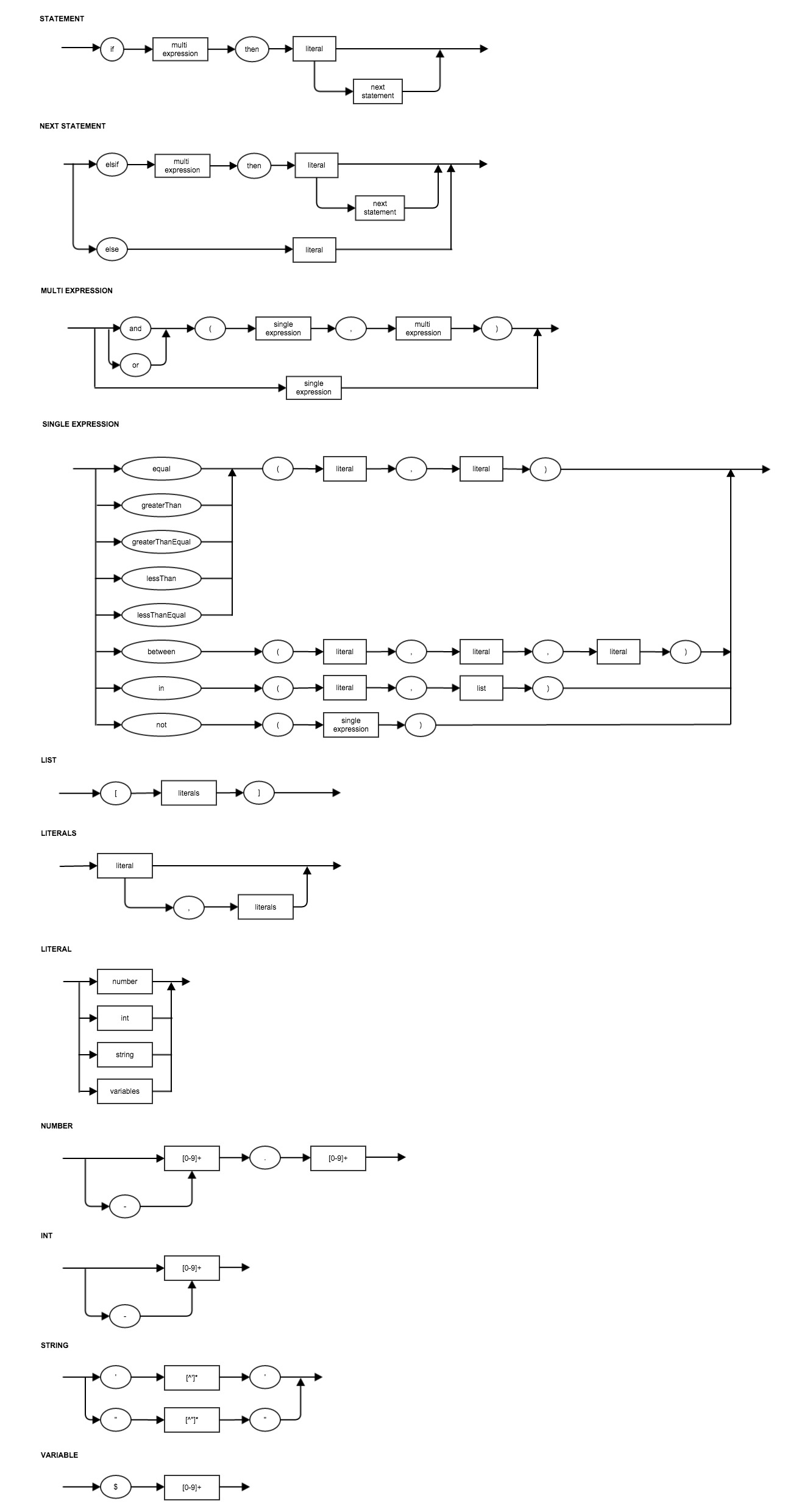
Format Statement Functions
You can use the following functions in your format string described above.
+-----------------------------------+-----------------------------------+
| Function                          | Description                       |
+===================================+===================================+
| equal(x, y)                       | x == y                            |
+-----------------------------------+-----------------------------------+
| greaterThan(x, y)                 | x > y                             |
+-----------------------------------+-----------------------------------+
| greaterThanEqual(x, y)            | x >= y                            |
+-----------------------------------+-----------------------------------+
| lessThan(x, y)                    | x < y                             |
+-----------------------------------+-----------------------------------+
| lessThanEqual(x, y)               | x <= y                            |
+-----------------------------------+-----------------------------------+
| between(x, y, z)                  | x < y && y < z                    |
+-----------------------------------+-----------------------------------+
| in(x, [a, b, c])                  | x in list [a, b, c]               |
+-----------------------------------+-----------------------------------+
| not(x)                            | !x                                |
+-----------------------------------+-----------------------------------+
Examples
Example Variables Format String Result
Null $1=Hello, $2=World NULL Hello, World
Empty $1=Hello, $2=World
Plain text $1=Hello, $2=World Test Test
Variables $1=Hello, $2=World $1 $2 Hello World
Single condition $1=Hello, $2=World $1 } Hello World
Parser Error $1=Hello, $2=World $1 }
Null check $1=Hello, $2=World } World
Number condition and double quote string result $1=Hello, $2=World } Hello World
Number condition and single quote string result $1=Hello, $2=World } Hello World
Number condition and number result $1=Hello, $2=World } 1.01
Number condition and variable result $1=Hello, $2=World } Hello
Int condition $1=Hello, $2=World } Hello World
String condition $1=Hello, $2=World } Hello
Variable condition $1=Hello, $2=World } Hello
Between condition $1=Hello, $2=World } Hello
Not condition $1=Hello, $2=World } World
In condition $1=Hello, $2=World } Hello
In condition with int $1=Hello, $2=World } World
In condition with variable $1=Hello, $2=World } Hello
And condition $1=Hello, $2=World } Hello
Or and condition $1=Hello, $2=World } Hello
Plain text and condition $1=Hello, $2=World Blah } Blah Hello
Plain text and condition with spaces $1=Hello, $2=World Blah } Blah Hello
Duplicate TabGroup
Use the following to duplicate a TabGroup. When duplicating a TabGroup all the values in the TabGroup are save to a new entity except for those attributes that are in the exclusion list.
// This geometry will be added to the new entity
geometry = ...

// These attributes will be added to the new entity
extraAttributes = new ArrayList();
extraAttributes.add(createEntityAttribute(...));

// These attributes will be excluded from the new entity
excludeAttributes = new ArrayList();
excludeAttributes.add("name"); // Note: this list only contains the name of the attribute to exclude

saveCallback = new SaveCallback()
}
duplicateTabGroup("tabgroup1", geometry, extraAttributes, excludeAttributes, saveCallback);
Disable AutoSave
Use the following to disable autosave.
disableAutoSave("tabgroup1");
Display Custom HTML Descriptions in view Info tab
To display custom info tab then you must first change the data schema descriptions to use html fragments instead of simple text. Below is a sample portion of a property with html descriptions.
Note: The default behaviour is to not display custom html descriptions which will then generate a predefined html template for the info tab.
<property name="Attribute1" type="vocab">
            <description><![CDATA[

    <p><b>Description</b></p>
    <p>Attribute description</p>
    <hr/>
</div>]]>
            </description>
            <lookup>
                <term pictureURL="files/data/vocab1.png">
                    Vocab1
                    <description><![CDATA[


        <img style="width:100%;" src="files/data/vocab1.png" alt="vocab1"/>
    </div>


            <p><b>Vocab1</b></p>
            <p>Vocab1 description</p>
        </div>
    </div>
    <hr/>
</div>]]>
                    </description>
                </term>
...
            </lookup>
</property>
After adding in the html descriptions you must then flag the view to use html descriptions via the ui schema or dynamic ui e.g.
In the ui schema you have to set the faims_html_description to be true.
<select1 ref="attribute1" type="image" faims_attribute_name="Attribute 1" faims_attribute_type="vocab" faims_html_description="true">
    <label>Attribute 1</label>
        <item>
            <label>placeholder</label>
            <value>placeholder</value>
        </item>
</select1>
If using dynamic ui then you must set html descriptions to be true.
viewDef = createViewDef();
viewDef.createTextField()
viewDef.setLabel(...);
...
viewDef.setHTMLDescription(true);
Now the info tab will render you custom html.
Tab showing and closing actions generally should be embedded within an event handler for that tab, as rendering doesn't occur immediately after the code is read.
e.g.
align: baseline;" title="Hint: double-click to select code"
ht: auto;vertical-align: baseline;background-image: none;
onEvent("tabgroup", "show" "onShow()")
ht: auto;vertical-align: baseline;background-image: none;
ht: auto;vertical-align: baseline;background-image: none;
onShow()
ht: auto;vertical-align: baseline;background-image: none;
ht: auto;vertical-align: baseline;background-image: none;
showTab("tabgroup/tab"
ht: auto;vertical-align: baseline;background-image: none;
ht: auto;vertical-align: baseline;background-image: none;
cancelTab("tabgroup/tab", true);
ht: auto;vertical-align: baseline;background-image: none;
ht: auto;vertical-align: baseline;background-image: none;
Arch16n